X-Pro3: a few tests with clarity

Following last week’s post, I was curious to test the X-Pro3’s new clarity function in a more controlled environment. What I’ve found—somewhat to my surprise—is that is appears to affect colour images much more than it does black and white. The image above was shot using the same DAIDO Acros preset I used last time but with clarity set to +4. I shot several versions of it, moving from clarity 0 all the way to +5...but showing them side by side would’ve been pointless because there really wasn’t much of a difference between them. And what’s strange is that I’m not sure I understand the reason for this—even switching between 0 and +5 didn’t do much visually. On the series below I changed tactics, shooting at 0, +5 and then -5. It becomes much clearer how the setting affects the final output.


If you set your gaze on the oregano flakes in the bottle you’ll notice they become much more defined on the +5 version. Why is it more intense this time? Only reason I can think of is a change in “frequencies”—as in the midtones in those flakes are more susceptible to the clarity setting.
Last series, this time in colour: my good ‘ole Doc Martens.


I don’t know about you but this time, it really makes a difference to my eyes. I’d describe each version as normal, grungy and hamilton soft. Just for fun I tweaked the +5 version to counteract the stronger shadows in the focal area:
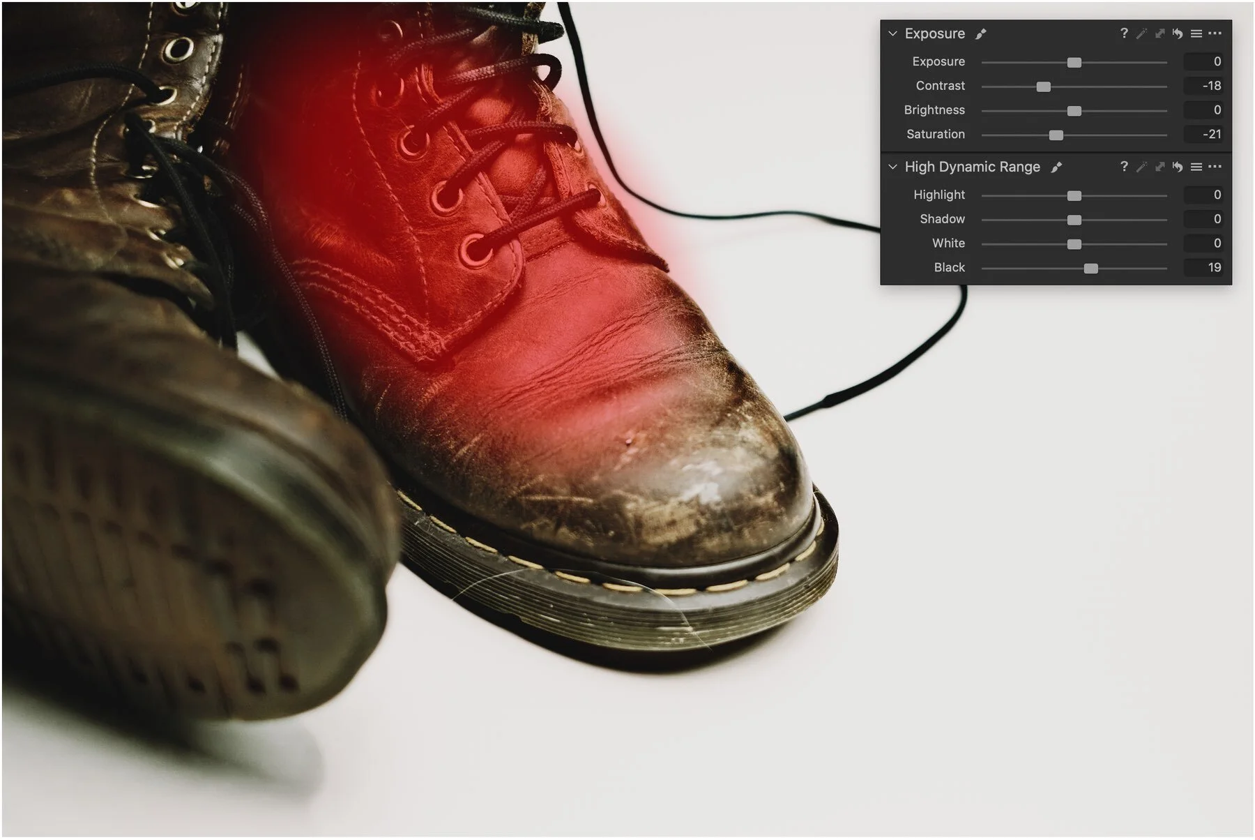

I’m not sure how often I’ll use clarity to be honest. But after this experiment, I’ll probably be much more agressive with it when I do. And I’ll make sure I’m also shooting raw, just in case.
Later
P.S All the images were shot with the XF 35mm f/1.4 and processed in Capture One Pro 20 (with Silver Rich grain added on the bw images).
P.P.S Yes that’s a hair on ALL THE BOOTS PICTURES. We have a dog…‘nuff said.