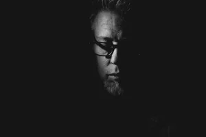
She breathed quietly, in rich black ink.

Shot with the X-Pro3 and XF 35mm f/1.4 R (Acros, pushed in-camera + processed in Capture One)


DISSECTION
As expected, I spent a few hours on Sunday going through my X-Pro3 settings, the owner’s manual in hand to make sure I didn’t skip any new features—it’s way too easy to just set everything the way you’re used to and miss out. We are creatures of habit after all. I’m still testing, trying to break out of old routines to see if some changes could be beneficial. A lot of it has to do with autofocus and experimenting with modes besides Single Point, even though that’s always worked fine for me; thing is, if you don’t try, you can’t know right? I’ve also added the new AF Limiter function to My Menu...really need to test this on a street shoot.
I recreated some of my goto custom presets, most notably the Acros-based Moriyama—which I’ve renamed DAIDO (I figured I could make it a bit more personal after all these years...!). As much as I love the new Classic Negative simulation, it would be a bit of a sin to reduce this camera to a one-trick pony. I’ve mentioned this preset before but just to revisit: it’s Acros with both Shadows and Highlights pushed in the camera settings. Here’s what it looks like in the new curve UI:
Yes, contrasty. It’s one of those things that you either embrace wholeheartedly, or use with Raw+Fine to keep a safety net under you because it will be unforgiving. Over the years I’ve messed around with NR and sharpening as well in this preset, sometimes adding sharpness and lowering NR to intensify grittiness even more. I’ve used camera grain as well, but I’ve always preferred shooting at higher ISOs to get that specific look. Truth is I’ve never really settled on settings beyond that basic tone curve. Now with the X-Pro3, I’m experimenting with another feature: clarity.
Clarity (along with Colour Chrome Effect and Colour Chrome Effect Blue) is a new parameter that can be saved as part of any custom setting. And it offers A LOT of range: we’re talking +5/- 5. Enough to go a little crazy, really. On the images you see in this post, I’ve only set clarity to +1. I know, I know...there’s no A/B images which makes mentioning this kind of pointless. But I wasn’t shooting for a technical post—I was just shooting... and this dissection came after. I’ll follow-up on the topic if I find anything worth mentioning.
The one issue to be aware of however, when using any of these new parameters I mentioned, is that they require some additional processing time. So every time you take a shot a “processing” UI will appear for about a second, maybe two; I haven’t timed it. Obviously this could be a no-go in certain circumstances, but I‘ve decided to give it a try...as a mental device. Let me explain. A few months ago I attended a Beer & Cameras event in Montreal, organized by Fujifilm (beer goes quite well with cameras I must admit). I got to hook up with Take Kayo again (we’d met the year before when I was in Vancouver to give the GFX 50R talk). He mentioned his use of Colour Chrome Effect Blue on the X-Pro3 pre-production he’d been shooting with. He said he didn’t mind the blackout, which at the time surprised me. But now that I have the camera once again, with its lovely idiosyncratic design, I can’t help referring back to the early days of my Fujifilm experience: that slowness many derided, but enough of us embraced. We no longer live within those same territories—the wild and relentless push of technology has seen to that. Which is good, of course. But it’s clear that, while the company needs to build faster and faster machines, they are also quite aware of the philosophical importance of “intent”—one of the interesting by-products of the X100 and early X-series. In fact it seems to permeate the entire mindset behind the design of the X-Pro3. So beyond whatever visual gains clarity or those other parameters may provide...right now, the processing they require forces a return to a certain “slowness”. I don’t dislike that. I’m inclined to refer to Eric Bouvet’s approach, the one he talks about in the movie Camera Punk ...which sounds like an almost meditative, even reverential state of mind.
A rather long-winded explanation…to say I’m willing to live with the blackout.
...
Last point: a contact-sheet. I shot three pictures of the wine bottles but ended up using one that may not be as obvious as the others. In terms of depicting the subject accurately I mean.
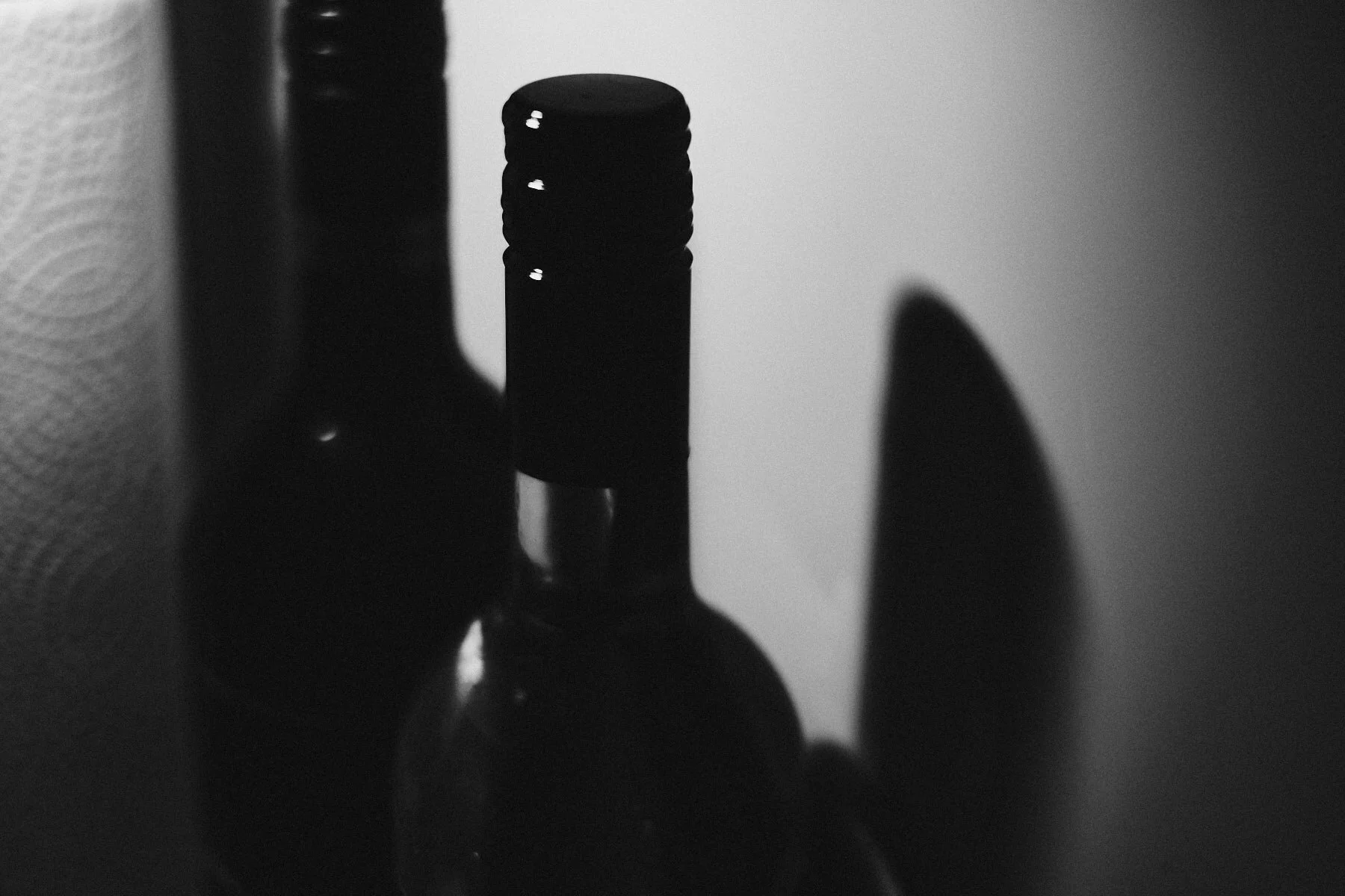
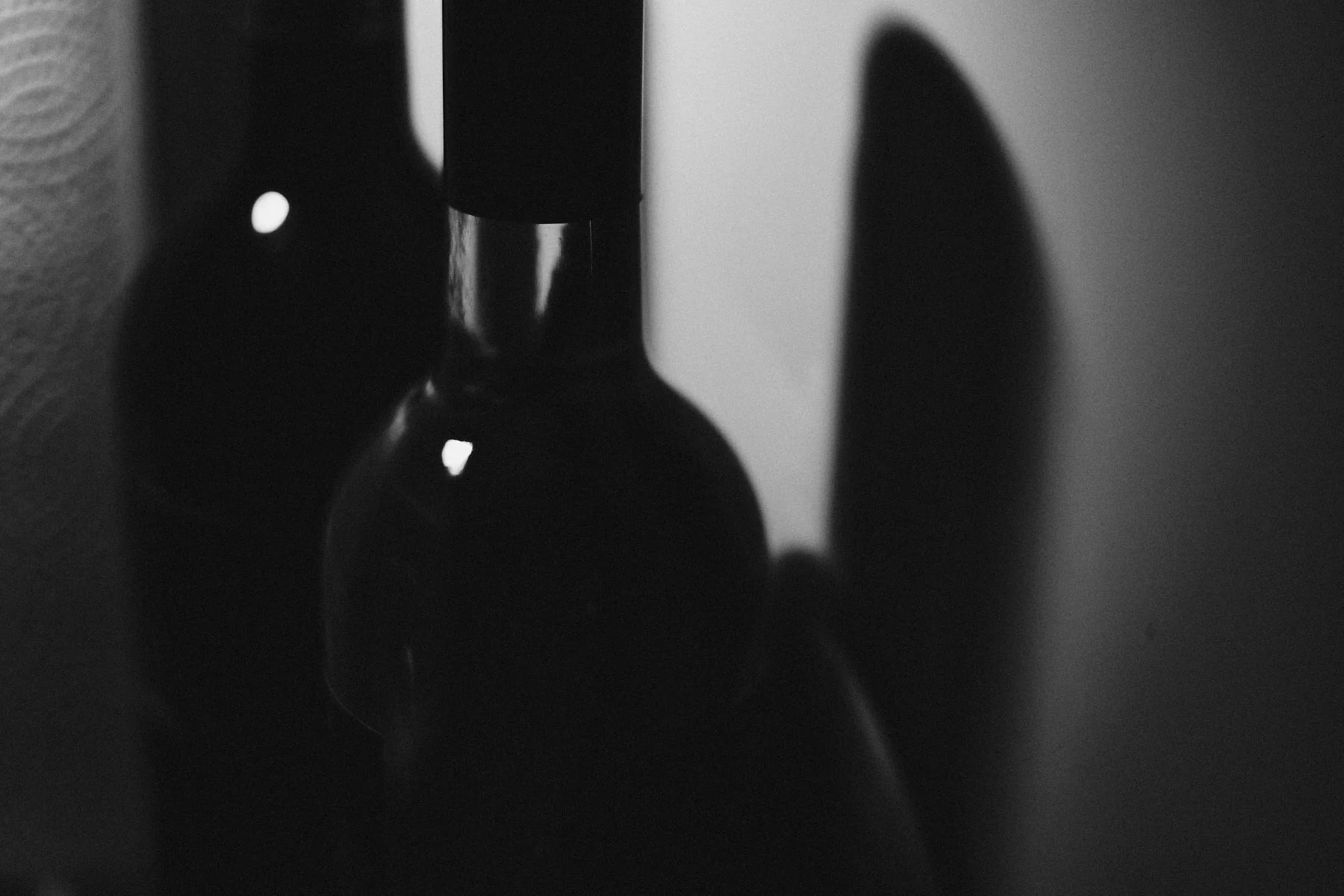
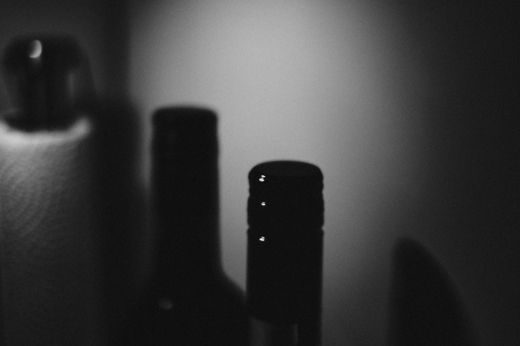
On image #1, the bottle cap is perfectly sharp and there are clear reflections on the bottle that bring out the glass. But image #3 immediately jumped out at me. Why? I believe it’s the less obvious angle, the negative space above the subject, even its lack of sharpness. Less geometry but more mood? I also prefer that diagonal line and lack of interference.
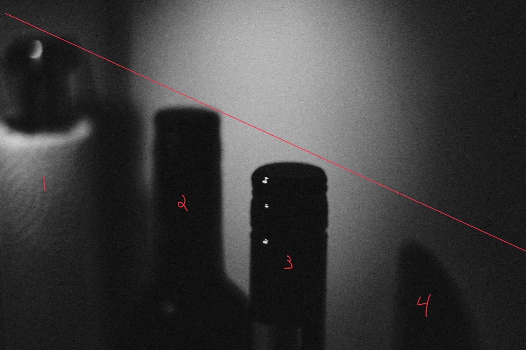
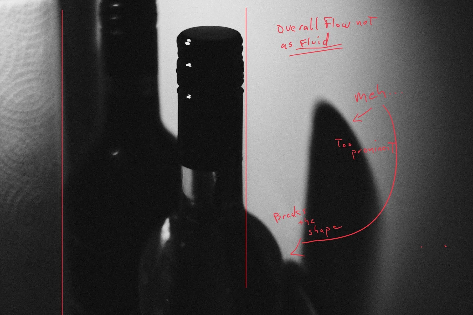
It’s also interesting to note the chronology: the first shot is technically ok, the second one is in transition and the last one is the pick.
It doesn’t always happen this way; sometime our first instinct is the right one. But it usually pays to explore…even very small moments.