Dissection 015
COLOUR GRADING P2
In the previous post, we looked at the concept of echoes and fractures within a sequence of images—how we can create a sort of visual rhythm, through the choices we make in both processing and selection.
That was about the why; this one’s about the how. I hope he won’t mind, but I’m going to use Giovanni’s comment on that initial post as a kind of roadmap. Because his instinct were good, but it’s also a great starting point:
I suppose your adjustments in the first "stylized" examples were made via color wheels, while some in the second example have been better done with white balance adjustments, right?
Partly. Let’s dive in…
Stylized - the window
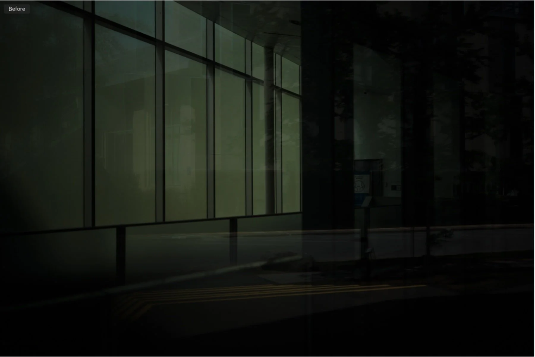
This image was part of the 23 mm f/1.4 promo shoot I did for Fujifilm, and as you can see below, the original raw is mostly underexposed in camera:
For the previous article I created three versions, and they’re actually all different from the one used in the film:
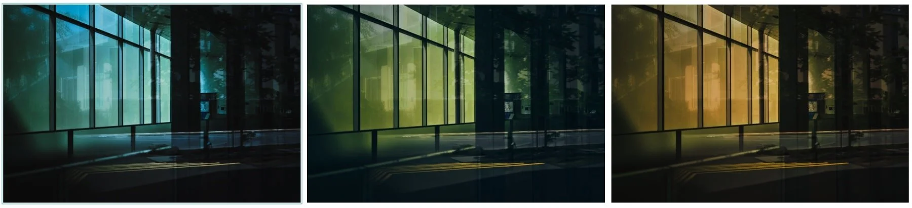
The variations use both Color Balance (wheels) and White Balance. I’ve mentioned before how I don’t use WB as much as I do the colour wheels, but that’s because I shoot in JPEG quite a bit. White Balance and JPEG files don’t enjoy each other’s company very much. With raw files, on the other hand, WB becomes an important and much more precise tool in our arsenal. On the blue variation, the Midtone colour wheel is heavily saturated, but it’s the white balance that clinches the deal:


The warm variation follows the same pattern:


The lessons here are to always remember that
We’re never limited to a single tool.
All the tools are co-dependent. We can use this.
Style +decontamination- the office chairs
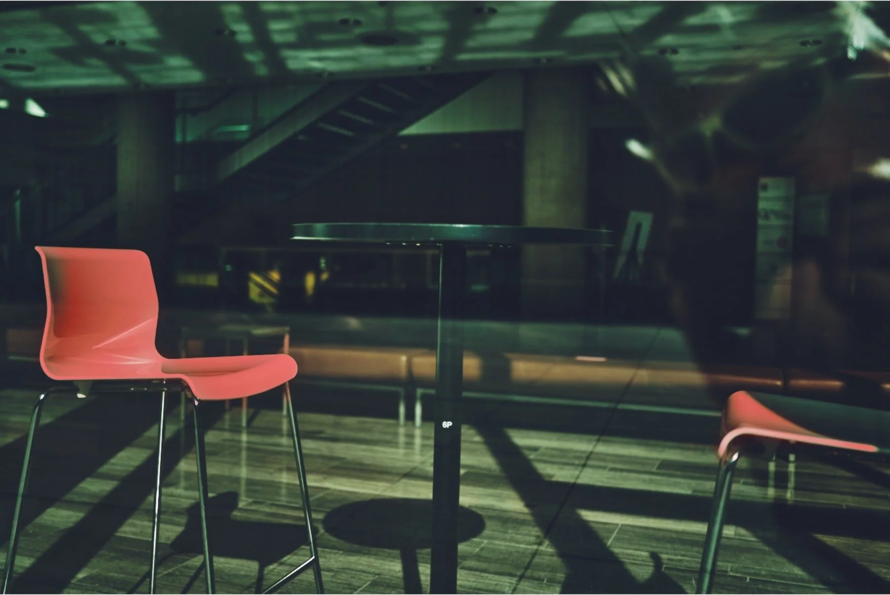
The method used in this image is similar to what we just saw, with one major difference: the colour processing made the office chairs in the window look a bit too saturated, which required decontamination. Here’s the green variation without local adjustments:

It’s normal for the ambient light (and colour) to affect the white chair—our brain expects this. But it feels borderline artificial, so the goal isn’t to remove it entirely, just make it less conspicuous. For this, we use the Magic Brush and two strokes, one for each chair:
And your basic saturation slider:

Rinse and repeat on the other versions in the post.
Decontamination 2 - the essay
I mentioned above how JPEG files and white balance aren’t very good friends, right? Well, these were all shot in JPEG—so no WB involved. And actually, each case required a slightly different approach.
GREEN CONTAMINANT

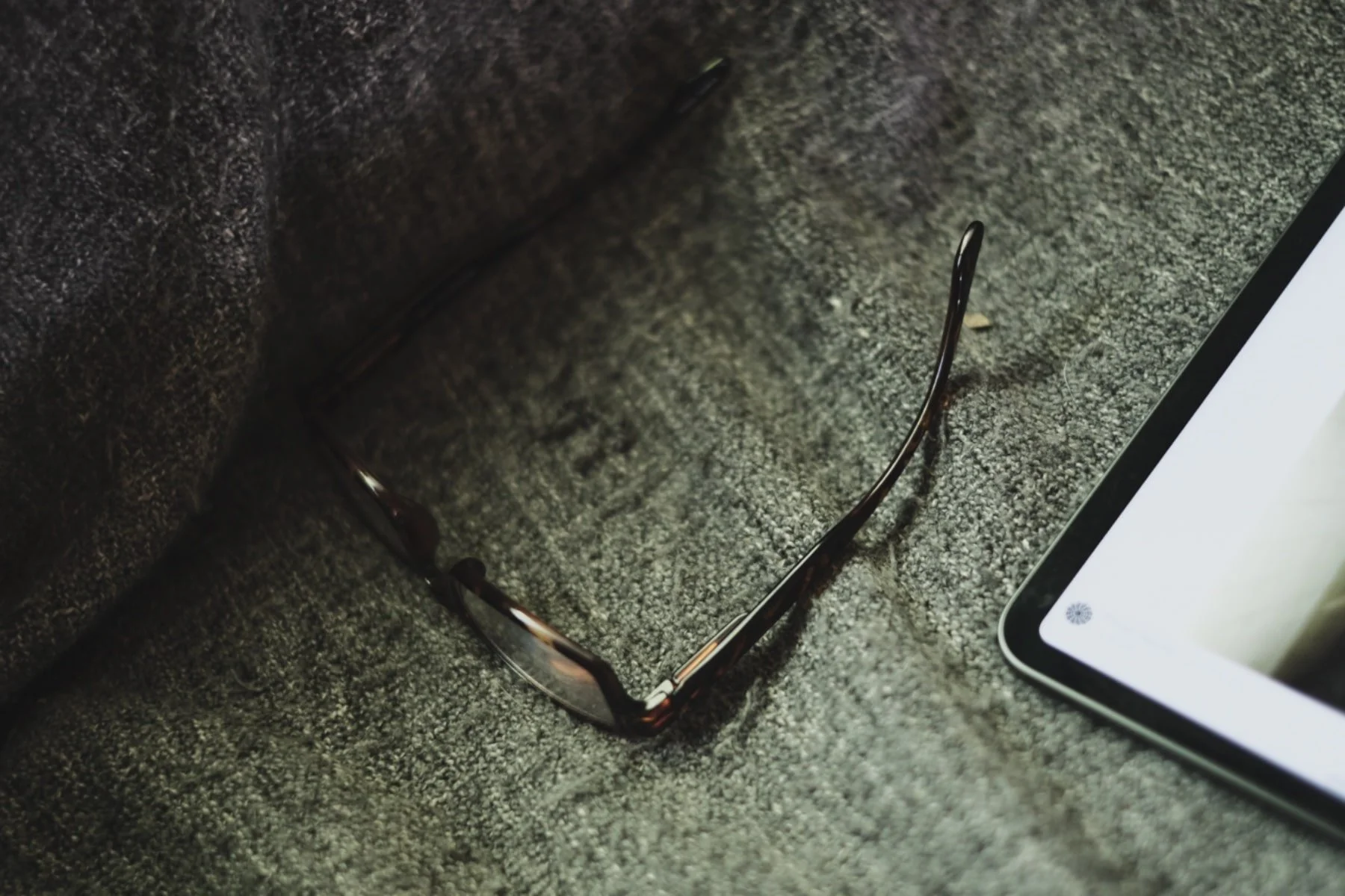
Original SOOC
The Advanced Color Editor is a great tool when dealing with a very specific colour. For this, I used the eyedropper tool, clicked on a green area and dropped the saturation: image Again, as you’ve probably noticed, not completely…because the world is rarely neutral. I was also taking the image 5 (in the original series) into account.

Guide image has a bit of green…
Could I have used the Magic Brush instead? Possibly. But the brush also uses luminance to create a mask, which was unnecessary for this image. It might’ve even made the operation more difficult.
YELLOW CONTAMINANT
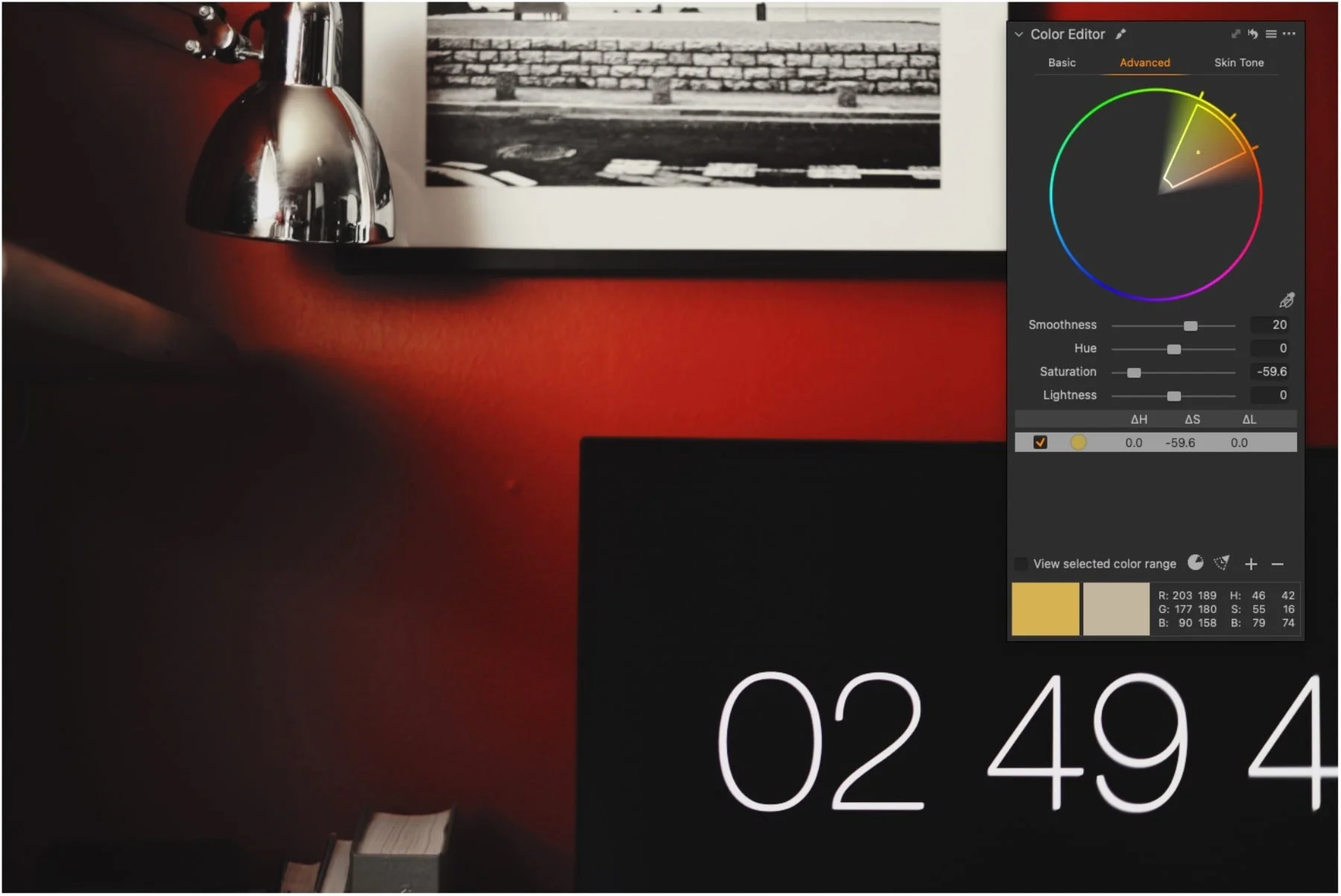

Same approach but heavier on the desaturation: we’re dealing with white and I wanted it to pop. I’d expected this one to require local adjustments, but a single layer did the trick. If it works…
FYI: I also used a Magic Brush layer to intensify the red wall.
RED BAG
On this last one, the idea was to create an echo by pushing the red of the grocery bag a bit more towards the red of the wall in image 6. Not replicate it, just move it closer. A mask was created with…you guessed it, the Magic Brush:
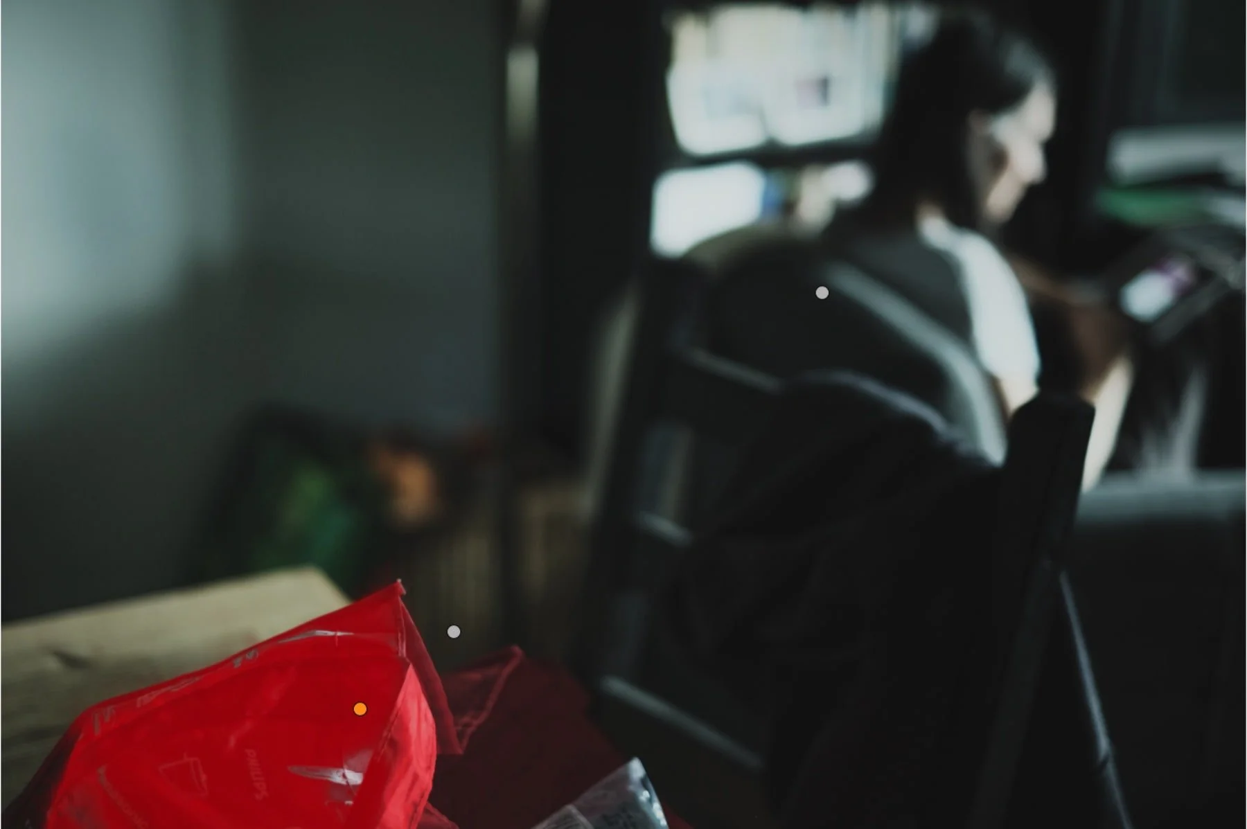
But there were several issues to deal with, beyond colour: the bag was underexposed as well. It took more than one tool to achieve the results:
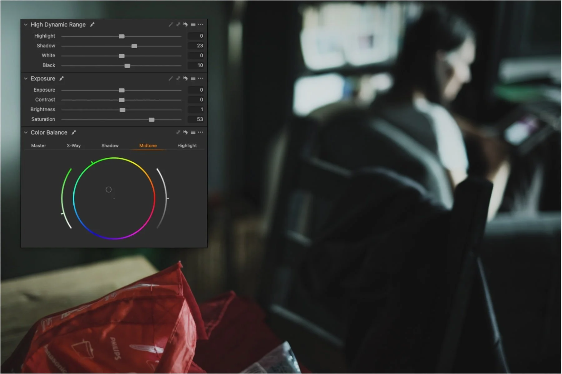
Notice the Midtones that are pushed towards green? The bag had a strong magenta tone—adding green made its hue warmer.
But wait: why not use the Advanced Color Editor again? Knowing I needed to also work on the exposure simply lead me to these other tools. But writing this post made me curious, so I tried it:
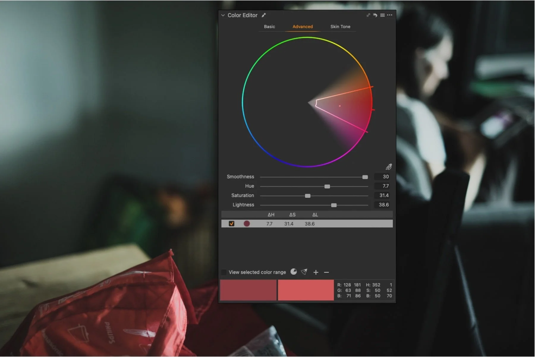
As you can see, it’s awfully close. And I think I prefer it: apart from the highlights that are a bit strong, the overall density feels more natural. Let’s fix those highlights and also drop the background of the bag a little:
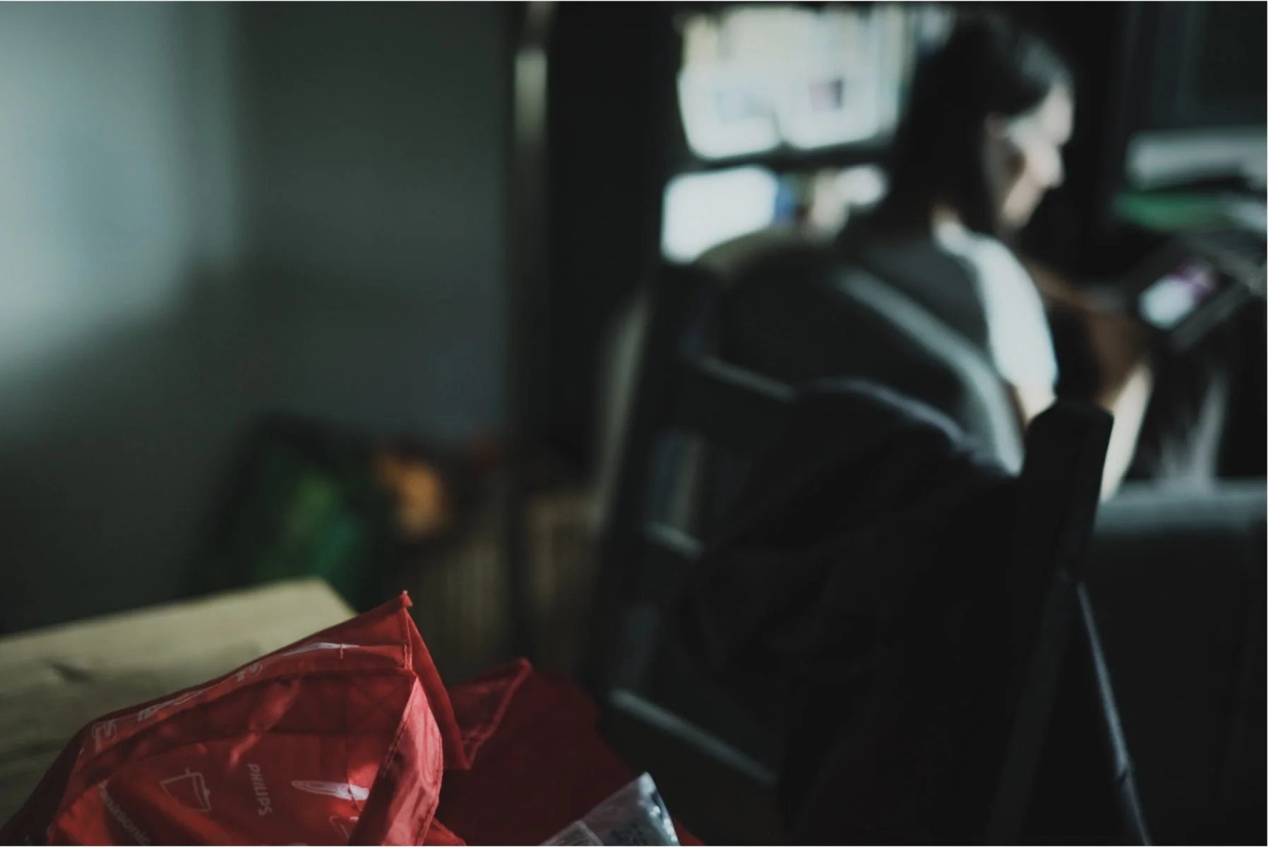
It works—another take on the same subject.
…
I hope you find this useful. The important thing is to understand how our tools function and what we can achieve with them. There’s no right or wrong, really—just different paths to choose from.