Colour grading: echoes and fractures

The single image tends to exist in a vacuum. Even when surrounded by other pictures, unless there’s a clear intention from the photographer to define it as part of a series, most people will judge it in isolation, based on its individual merits.
As soon as we present an ensemble of images however—an essay, a book, an exhibition—that dynamic changes. Especially if a theme is put forward. The viewer then expects a thread and is conditioned to see one, to make associations pointing to a greater, unified message. The result, for us, is an expanded toolset: processing and selection are no longer siloed but interconnected, every decision on one image affecting relationships to others. It becomes more complex but richer, like using an entire octave instead of two notes to compose a melody.
An ensemble requires sequencing, which in turn introduces the notion of flow. Within a series, everything in an image will affect how it connects to the ones before and after—composition, subject, geometry. In this post, I’d like to focus on the use of colour.
Variants
Let’s take the most basic building block at our disposal: warm vs cold. It’s a simple element that thoroughly changes how we perceive an image and how it makes us feel: blue tones infer reflection, warm tones evoke comfort—feel free to add every associated psychological implication here.
By default, we tend to consider cohesiveness as a synonym for uniformity. But with visual work, we need to consider the rhythm of the eye as it moves from one image to the next, as well as the way each picture can complement another. In the following examples, I’ve purposely created different versions of the same images. Most of the processing is identical, except for toning.


Let’s create two layouts with those four images, each one using a similar colour space:


I’d say both could work. They’re visually cohesive, in this case either warm or cold. Now let’s mix things up:

This is entirely subjective, but as a series—let’s say a large wall print—the division between left and right bothers me. I can’t seem to escape the verticals: I see two diptychs, side-by-side, instead of a single quadrant. The two verticals work on their own, but the group doesn’t. Let’s try a slightly different sequence:

Again: subjective. But to my eye this is better. Several things are happening now:
I don’t see diptychs anymore.
The layout feels more balanced.
The diagonals are introducing movement by forcing me to look more than once.
The result feels less static.
More importantly: despite the use of mixed toning, this remains cohesive. Why? Because we’re using echoes.
Fractures and echoes
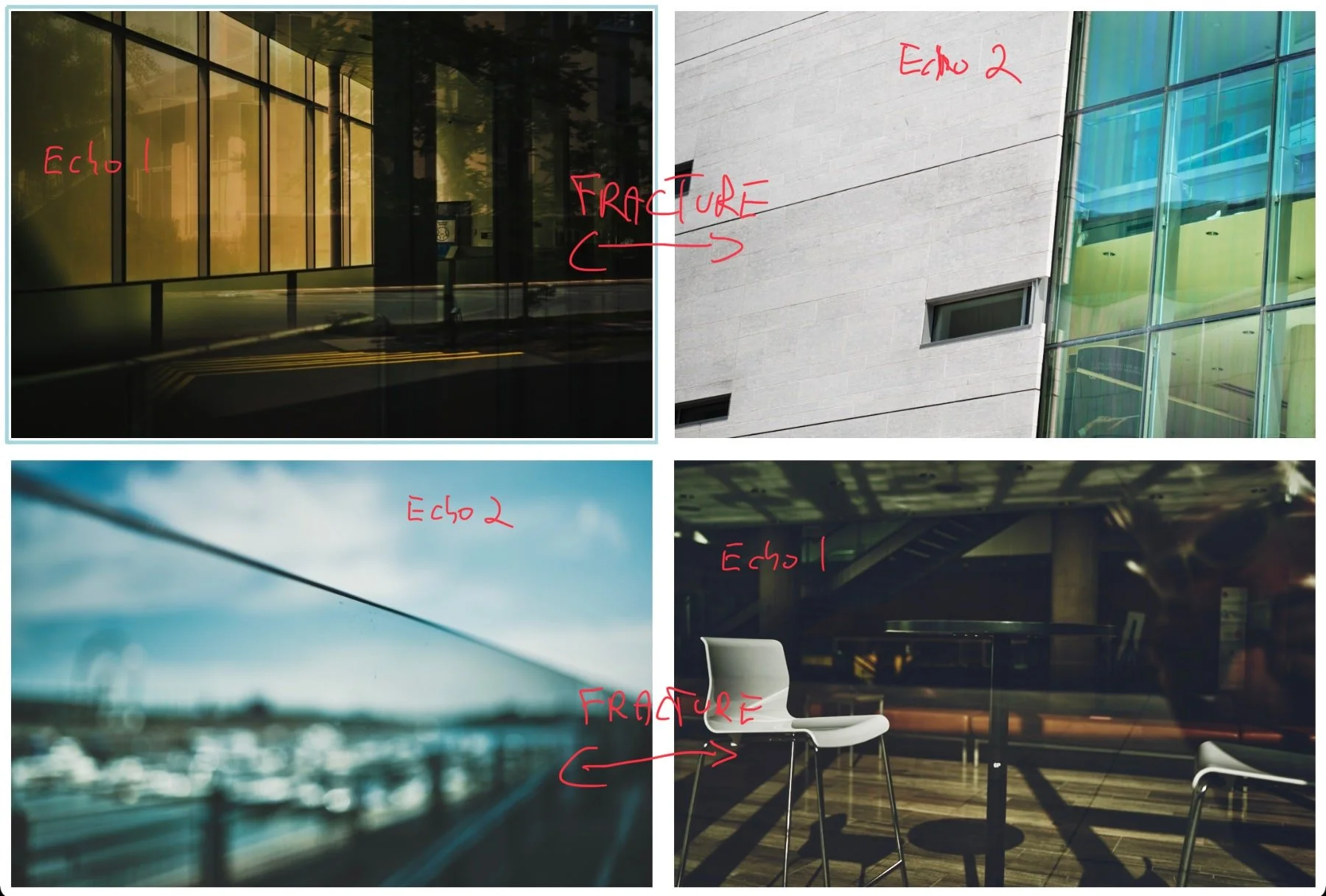
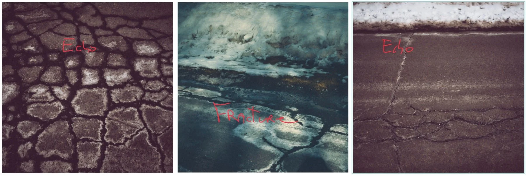
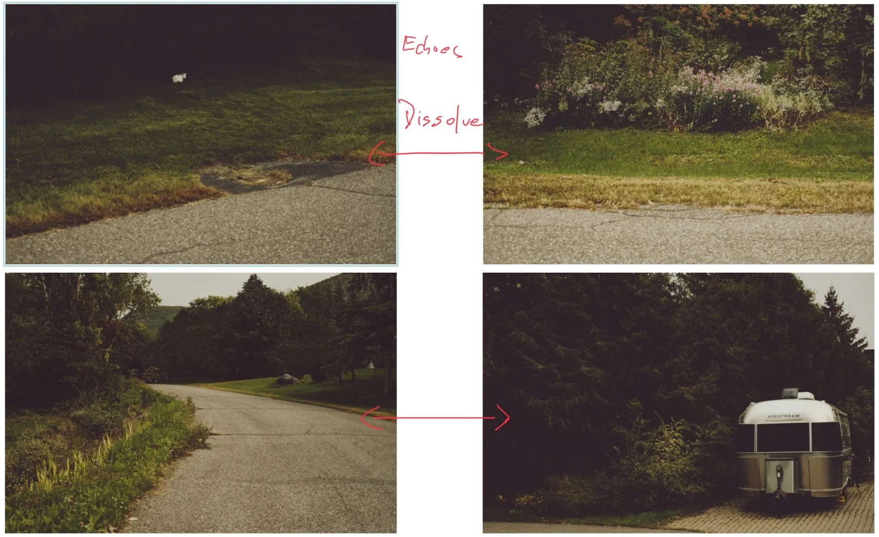
A series is a lot like a short film or a song: it’s a story told through fragmented pieces that are edited as one. In both cases, we’re working with breaks and transitions—I call these fractures and echoes.
In film parlance fractures represent hard cuts, and consecutive echoes are cross-dissolves. But when echos are spread apart, they change: they become a thread that ties images together. Through repetition and recognition, echoes provide visual cohesion.
thread
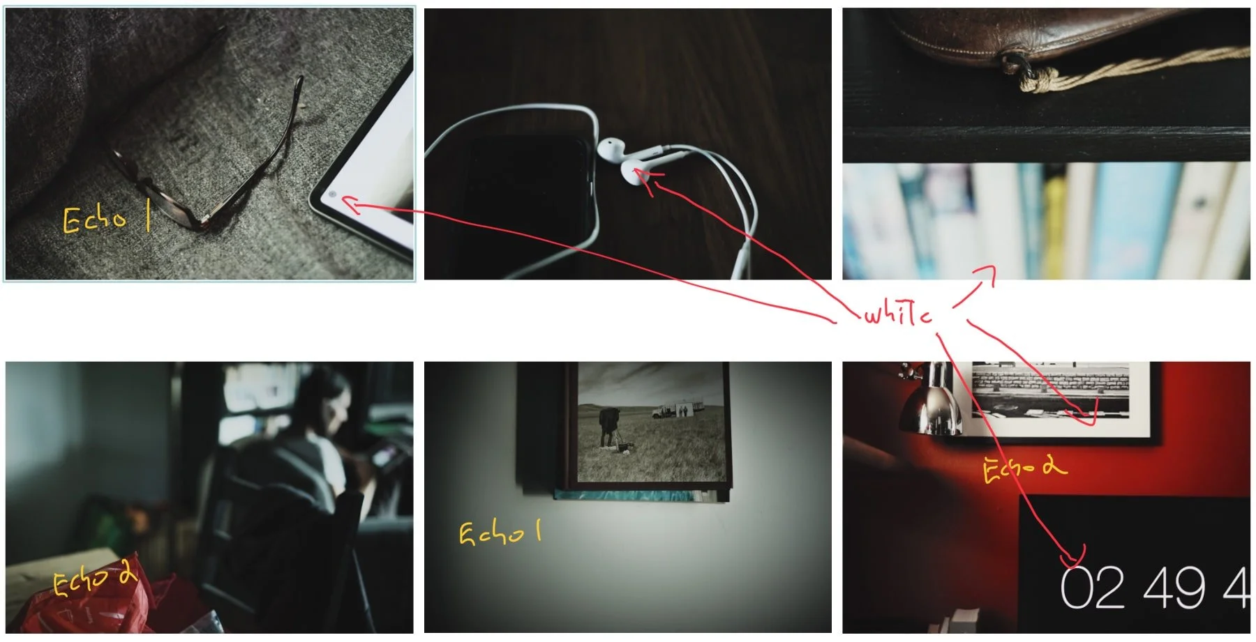
The images I’ve used so far are all very stylized. But we can incorporate this concept into our processing in a much subtler manner, even as we evaluate how to adjust and/or correct our images. In the following example, we see two red areas and two grey areas. The grey in the first image has a slight green cast, and the reds aren’t the same hue. There’s also a yellow cast in the last image, on what should be white and grey zones.
I chose this particular series because of its very light approach to processing, to show how small adjustments can still make a difference that isn’t so much seen as felt. In the final version all similar tones are now “echoing” throughout, linking images together in a natural way. Here it is after processing and corrections:

Final notes
I hope you don’t come away from this post thinking you should always create 10 versions of an image before deciding anything. I certainly don’t. The idea is to simply be aware of these notions when you’re grouping images together. In my case, there are usually one or two pictures that end up providing the overall direction, from which everything else will be adjusted. And it’s an iterative process, so don’t worry about not seeing the bigger picture immediately, but remain open to the possibility of adjusting the colour of an image—even one you considered “done”— in the context of an ensemble.
For what it’s worth: the intense colour variations of the EXP 77 style pack (included with your membership) will provide an interesting playground to experiment with all of this.