Spirit of '22
Welcome to my new home, folks. Yes, the decor has changed. Unlike the 2019 refresh, however, which was mostly aesthetic, this redesign is actually both a course correction and a much deeper structural shift.
Some weeks ago I wrote a post entitled The Filial Shear, in which I quoted from Jason Kottke’s self-interrogations about his blog, about content creation in general. I’ve been doing an awful lot of thinking on this matter, and not to go all psycho-babble on you, but… it turns out I’ve been overwhelmed by the weight of what I publish. Allow me to clarify: it’s not the work itself—it’s the fact that all of it exists, solely, to disappear. For most people (including myself) stories live on the homepage, until they don’t. Until they’re relegated to an archive page, a long list of dates and titles, fully disconnected—and invisible. Case in point:
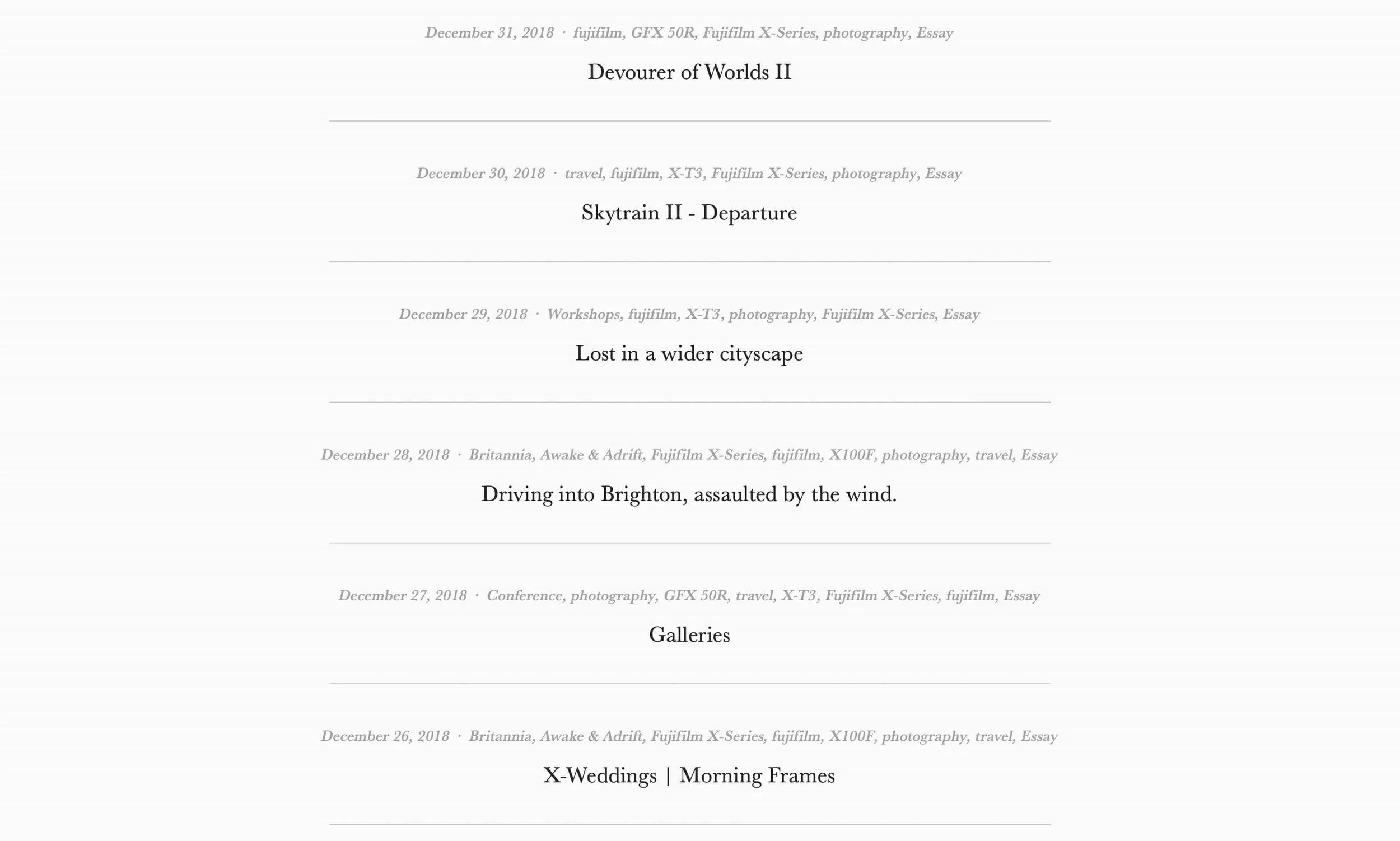
Woot.
The net result has been an (unconscious) sense of profound futility. Like filling up a joke bucket with a hidden hole on the bottom. Sisyphus pushing his rock. A decade of stories and little to show for it.
No more.
Get lost
The journal is now the homepage.
Content is king.
Long live the king.
This new site uses a reverse chronological, highly visual, infinite scroll design, where every post, every story, displays its distinct identity. Scrolling down is like flipping through years and years of magazine covers, everything instantly recognizable.
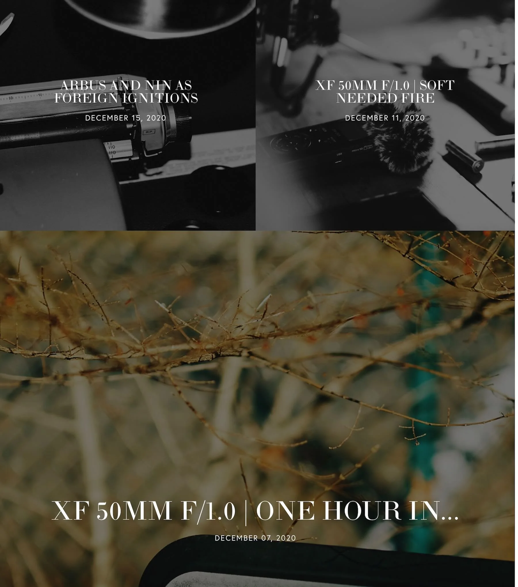
On the new archive page you can target a specific year, topic, or camera model to get the same experience, but confined to your selection. Pick 2014 and you get an instant 2014 publication—try it, it’s pretty cool.
The posts themselves also reflect these changes: large, full-page banners introduce the content; left and right navigation arrows remain visible, throughout the entire page, allowing an easy back and forth between stories, at any point. Again, just like browsing a magazine (the effect is especially successful on an iPad in portrait mode).
NOTE: floating navigation isn’t working well on the live version for some reason. I’m evaluating. Darnit.
...
Front-facing features were important—but the stuff in the backend was equally necessary, and a more complex undertaking. In Squarespace 7.0 terms, I’ve gone from an index-based site to a page-based site, which required some pretty extensive manipulations. And as with all major changes, it came with design compromises: full-width banners aren’t possible anymore; ditto for slick extended pages with parallax scrolling. A lot of content had to be entirely scrapped or re-created. Bottom line: I’d been using indexes forever, so yeah.
But while certain features were lost in the process, I’ve gained in terms of simplicity, which was essential to me. Letting content—all content—become the main driver, makes the site easier to maintain, but is also completely in line with where I am now, in my life. Less friction means more time to create, more time to breathe. Above all: I feel like I’m building on a firm, concrete foundation—as opposed to always shovelling dust into a heavy breeze.
The weight has shifted. It’s not just about the future anymore—the past and present matter again.
I believe I’m good to go.
P.S Some sections are still a work in progress: I’ll be adding finishing touches over the next couple of weeks. Music will be back as well (it’s getting a more important overhaul).
P.P.S FYI: The archive works fine until January 2013. Anything prior is a mix of smaller images, all the way to posts that were originally hosted on Wordpress, many of which are broken (long story). I’m hoping to slowly bring them back to current standards…but it’s not a priority.