Notion and lessons in UX
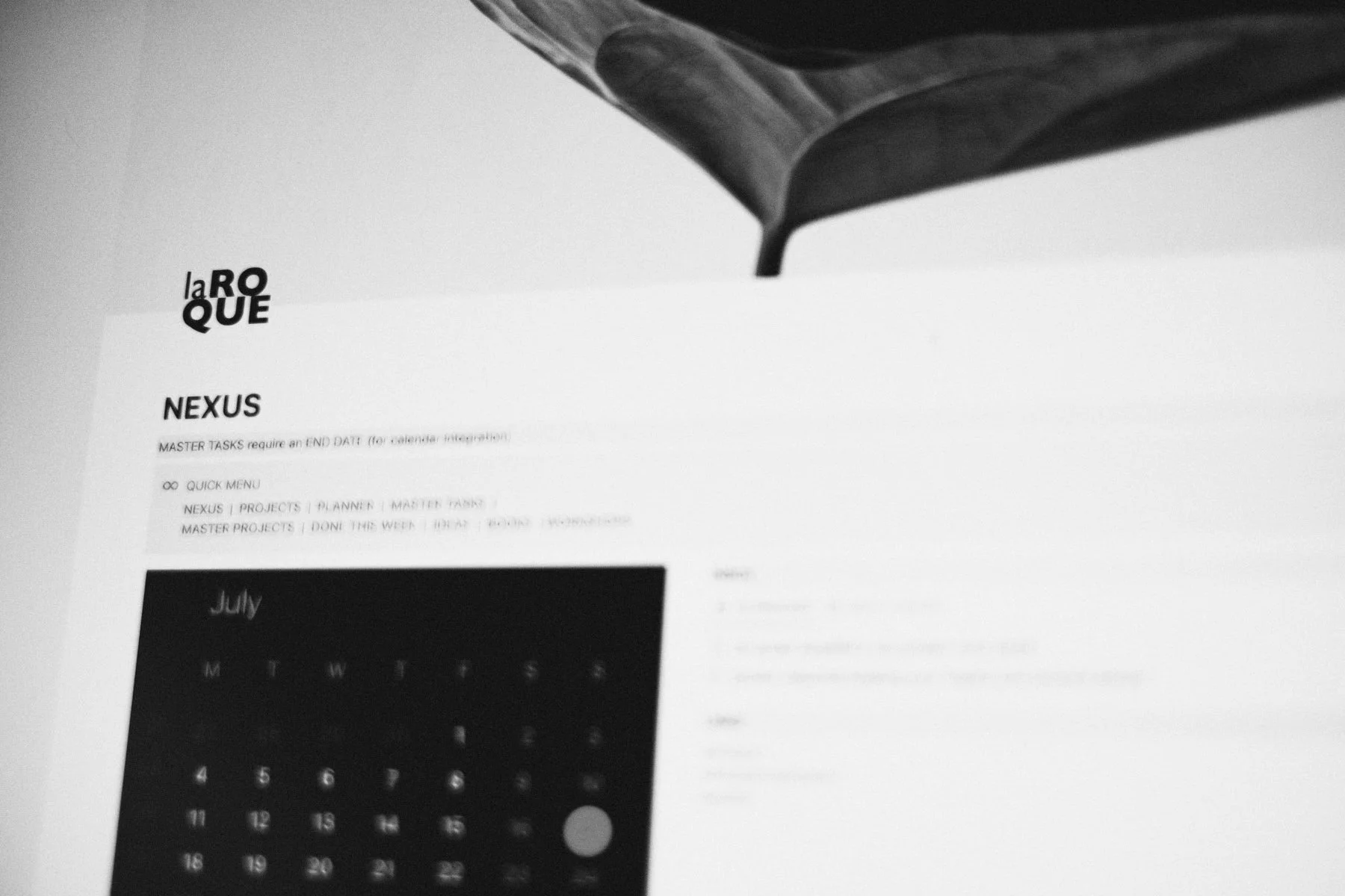
“We’re space debris. Most of the time we speed through this vast expanse, weightless, until we come across a body whose pull is strong enough to slow us down. Our trajectory then becomes an orbit, dust coalesces and takes shape, and our path turns from chaos to order.
Until gravity comes meddling again.”
I was lured into Notion’s orbit through a video featuring Marie Poulin. Of the gazillion people creating Notion content on YouTube, she’s by far the one I find most interesting and engaging. I think it’s mainly because of how profoundly she’s integrated this app into her everyday life and work: she wields it like a musical instrument, elevating it into much more than tech. It’s inspiring to watch. And the results are stunning: her dashboards are full of great big images, her templates perfectly assembled, every icon tweaked into aesthetic bliss. It’s the real deal too, no question. In fact, I was able to replicate a lot of it and, for a while, I felt fulfilled: I’d finally discovered a way to create a visual task manager, something that would speak to my senses as much as my head.
And then last week, the affair ended.
…
This won’t be a post against Notion. I think it’s fantastic software, and I’m keeping it around to manage a couple of databases that I find useful (the Readwise integration, for one). But here’s the rub: in 2022, UX matters—a lot. We know how apps are supposed to behave on any given platform; we’ve seen it, we’ve experienced it. None of this is new to us anymore. A lowest-common denominator approach—while understandable in today’s competitive environment—is, I believe, a disservice to everyone in the long-run.
There was a discussion about native vs non-native apps recently, in a Slack channel I follow. Someone was arguing that it was all a fake argument, that Electron apps, for example, were no different from applications built specifically for a platform. That’s a lie. Setting aside performance issues, while there can be good Electron apps, they are all a compromise in terms of user experience.
I don’t know if Notion is built on Electron, but it’s clearly a web app in a wrapper. Which leads to friction: many conventional keyboard commands don’t work; drag and drop is hit or miss (mostly miss); undo is unreliable. In the two months I spent immersed in it, the app always felt brittle—as if I was always one click away from messing up a page’s layout. Chrome was everywhere, garish and noisy, UI conventions be damned. On the Mac I kept accidentally selecting and deselecting blocks, for instance, or dismissing filters only to see them re-appear seconds later (there’s a lock page function to avoid this but…it locks the page, which leads to constant locking and unlocking). I’d settled on a light UI, but Notion would randomly switch to a dark UI, requiring me to hit a keyboard command to set it right. I never understood why. None of these were dealbreakers, but still an unavoidable litany of tiny interactions building up over time.
Mobile devices, however, were a different story: split-view on iPad? Not supported. Shortcuts? Nada. Notion wouldn’t even recognize url-schemes for inter-app communication. Touch was mostly badly implemented, with blocks and functions often difficult to target. As for the iPhone app: a desktop crammed on a 6 in screen, without any UI considerations beyond basic resizing. (1)
…
In my infatuation I’d also fallen into the boiling frog trap, slowly cooking myself in an increasingly thick soup of workflows without even realizing it:
I had a mix of automations triggering through either Zapier or IFTTT, most of it to circumvent missing integrations.
I’d returned to Google just to sync my tasks to a dummy calendar. It wasn’t even a good solution either: just a one-way, one-time sync that would break as soon as I made any changes to the original task.
I’d found and copied a set of complex formulas and properties into my main database—just to get subtasks.
I’d added a TinyURL shortcut to my Dock, to translate URL-schemes. This would launch Safari every time to open app-specific links, but it worked. Sort of.
All week long I was also managing my tasks to death, adding images and icons to make everything pretty on my dashboard (because templates are fine, but they eventually lack visual variety).
And then came the final blow. We were away on a weekend and I picked up my MacBook, at some point, to quickly check something in the Notion app. But I was greeted by a blank dashboard page and an alert: «You must connect to the internet to view this content offline». Or something to that effect. A fun paradox to juggle with, I guess, but whoa. If I’d been on assignment, relying on Notion and without network access, what then? The following Monday, I decided the experience was over.
…
But we learn from everything, including wrong turns: a lot of the work I did in Notion has led to a better setup than before in Craft and TickTick. Anytime we put some thought into our workflows, there’s a tiny bit of additional clarity that seeps in.
Most importantly, however, I now know I can’t and won’t compromise on UX. I need apps that feel like full-fledged citizens on every device I use—or at least close enough. (2)
Lesson learned.
––––––––––––––––––––––––––––––––
Notion isn’t alone in this: Obsidian is equally rough on iPad and iPhone—enough to make me stay away from the app entirely, even after several attempts.
TickTick, like most cross-platform task managers, isn’t native, and it shows at times. But the apps never feel like a webpage, and they include important native integrations that add to the illusion (more than barebones widgets and shortcuts for instance).