LEVEL A: Paper, backstory and a processing video


A couple of weeks ago, I released a new Capture One style pack for 1EYE SOCIETY members. This is the fourth pack so far (we launched with two), but this one is a bit different: I wanted to test how far I could go in simplifying the processing workflow.
Working in Capture One usually involves applying one of my custom styles, as a baseline, then adjusting several parameters until I’m satisfied with the results. It’s a bit like cooking: I’ll check Brightness or Exposure (depending on file type), play with the Shadows and Black sliders to see how much I have to work with, adjust the Tone Curve etc. I’m used to identifying everything quickly, so I rarely get dragged down by these steps—they’re just part of the job.
But I’m also well aware that this isn’t necessarily easy to follow: when I give workshops and need to explain all these different slider/tools relationships, their complexity quickly becomes obvious.
So I went back to the drawing board. I took a good look at the tonal characteristics of the styles I use most, and tried to figure out how I could minimize those steps without sacrificing anything. All the previous Style Packs have been a reflection of the complexity I just described: they combine multiple tools in a way that can be a little hard to decipher.
LEVEL A is a wholly different beast.
Imagine a control panel. It has three sliders that can move in tandem. And these sliders might be all you need. That’s the idea. Everything (well, almost) is meant to happen within Levels. The pack contains three styles: PAPER (colour), as well as ROOM-01 and ROOM-02 (both black and white).
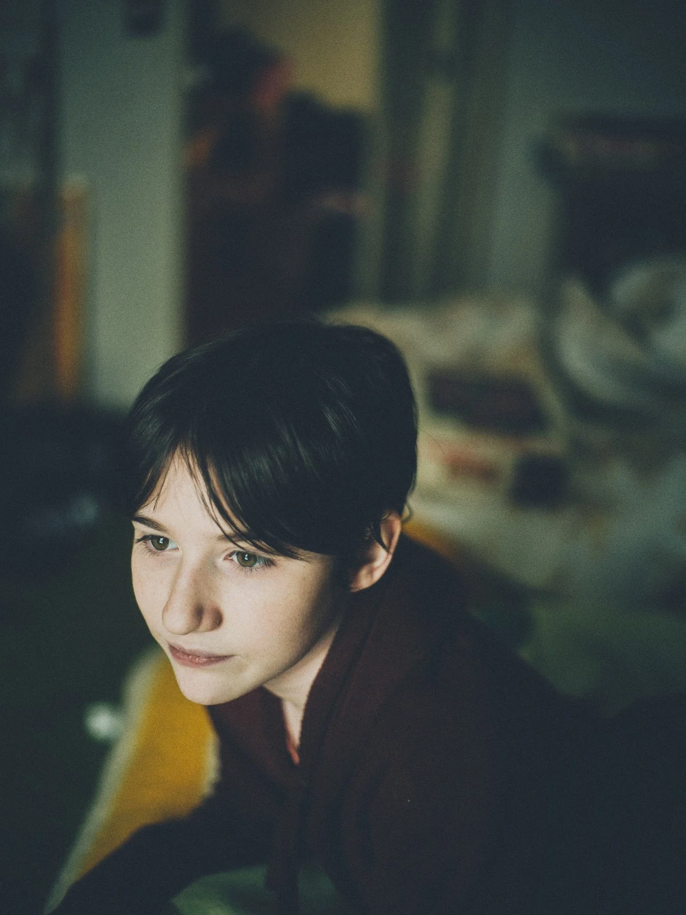
This image (and all others on the page) was processed with PAPER. All adjustments made in the Levels tool.


I recently produced a video to show members how I use the PAPER style, but it also serves as a general primer on the Levels tool—so I thought I’d post it here as well.
In case you’re curious: the ROOM styles take their names from Saul Leiter’s In My Room, the book that inspired those looks. PAPER, on the other hand, evolved from several sources, including the RUBICON style—I see it as a less obscure, easier to manipulate version of it.
I hope you enjoy this—happy viewing :)