Masks & Lightroom - P2
Part one was more of an assessment of masking in Lightroom as a whole, after moving away from Capture One. I shared a few tips, along with general impressions of the app's various features. For part two I'm focusing on real world examples.
We've seen some changes since the last instalment. With the April 2023 update, Adobe added two notable features to the Develop module:
The On-Off switch now defaults to an Eye icon that changes appearance when a panel is in use. This a) makes it easier to quickly see which settings have been applied, and b) the icon also acts as a preview toggle (click + hold).
The list of masking tools now includes curves.
I won't say finally, but...yeah, finally. The curves addition is a major step forward, because this not only offers local control over contrast and density, but also toning, through the red, green, and blue channels. Really, it's as if all limits have been lifted through this single update, and we've now reached the point where masking, for me, feels pretty feature complete. Capture One also offers local adjustments for colour grading and levels, but both can be replicated fairly easily with this new curve tool.
can't I...? Instead Of?
Masking can be overwhelming to newcomers. Beyond the concept itself there's also the sheer amount of tools involved, often leading to confusion as to when to use what. In fact, the most common question I hear whenever I'm teaching anyone about this is:
Couldn't you have used (insert any other tool) instead?
And the answer is usually yes. Yes, you CAN use a brush instead of a gradient; yes, you CAN paint a mask by hand instead of using a range tool, or an AI tool. As paradoxical as this may sound, the sole reason all those options exist is to make our lives easier. So my golden rule for masking is always based on a single motivation: laziness. What's the quickest possible route to the selection I need.
This is typically based on a couple of factors:
Geometry (a natural shape to follow).
Tone (a range of luminosity, or colour, to use as target).
Direction (an existing movement to accentuate within the image, i.e a ray of light).
Let's break this down with an example.
The image above was a test, and it's one of very few instances that pushes the limits of my M1 MacBook Air: a 40MP X-H2 raw file, containing twenty active masking layers, often applying multiple adjustments, and many containing submasks (what Adobe refer to as components). To be clear, most of these are purely corrective: I shot the image without much thought, and decided to play with it afterwards. On a real product shoot I would've used a tripod, I would've moved either the strobe or the brush on the table to better line up the shadows (avoiding the base of the lamp) etc. I also would've removed the plastic inner sleeve behind the album—this was early morning, I was winging it, yada yada yada.
That said, I used most of Lightroom's masking tools, so let's go through the most significant adjustments.
RADIAL GRADIENTS: MASK 2, MASK 4, AND MASK 8
All of these highlight the two most common reasons for choosing a radial gradient: shape, and direction. This is probably the type of mask I use most often, especially as a baseline, because it's quick, feels natural on most subjects, and can easily mimic a light source. So Mask 2 follows the shape of the lamp, adding a slight push on the exposure.
Mask 2
Notice that I've allowed it to bleed over the edge of the table, mimicking the light's typical falloff.
Mask 4 uses direction to re-light an area that felt too dim, by angling the exposure adjustment:
Mask 4
Finally, Mask 8 does something similar, but for the lower left side of the turntable (it also boosts clarity and structure for added detail).

Mask 8
Aligning 4 and 8 tricks our eye into accepting that this is all coming from the same light source. It adds dimension to the image, but also clarifies its messaging: a small scene, lit by a single object. The entire composition also leads to a central triangle:
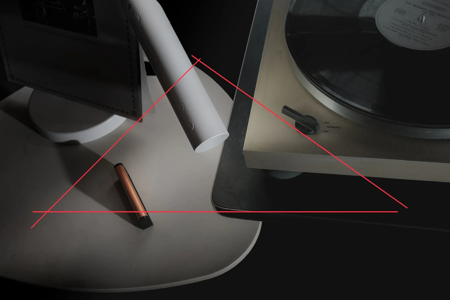
The triangle should be rotated a little to the left…
LINEAR GRADIENTS: MASK 1, MASK 9, AND MASK 16
I'm using linear gradients on several layers, but these three particular masks all serve the same purpose: asymmetrical vignetting. 1 and 16 drop the Exposure to burn the edges and accentuate the middle of the image, while 9 hides unwanted details beneath the table (by dramatically lowering the Black slider).


Combining tools
The examples above are all pretty simple: in each case a single tool is used to define an area in the image. But masking becomes much more powerful once we start combining several of those tools together. There are three methods available:
Add
Subtract
Intersect
Add and Subtract are self-explanatory: the most common example would be to select the brush tool to either paint-in, or erase, parts of a mask. Like this:


Notice the different icons in the masking panel, indicating which tool is in use, as well as their order. The first mask is always at the bottom, so this means:
I started with a Radial Gradient on the rubber foot.
I clicked Add, chose the Brush (low flow, high feathering), and painted around the gradient to smooth out the area.
I clicked Subtract, chose the Brush again (high flow, hard edge), and removed anything painted by mistake on the turntable (tip: you can draw a straight line by clicking point A followed by shift-clicking point B).
Here's another example, this time using Subtract with two Linear Gradients to create a square(ish) mask:


If we decode this one we get:
I created a normal Linear Gradient to target the entire surface of the table, from right to left.
I clicked Subtract, chose Linear Gradient again, and drew it over the entire bottom portion of the image, removing this area from the mask.
Btw: this mask is just adding a bit of saturation back to the turntable (it has a slight bronze tint).
Intersect is a more specialized option. This is how Adobe describe it:
Intersect Mask with
Select this option to create a new component in the existing mask that intersects with the other components of the same mask.
So, intersect will... intersect! Here's a visual representation:

When this is used, the only active part of the mask (where our adjustments are visible) will be the area where both tools overlap. In the following example, I use this to target a specific colour inside a mask:


I created a Radial Gradient to quickly target the cleaning brush.
I held down the Option key (to change the Add and Subtract buttons to Intersect) and clicked, chose Colour Range, and selected the orange area.
The Radial Gradient’s purpose is to create boundaries, limiting the scope of the colour range to a specific zone (as opposed to the entire image).
Now, lets' play alternate universe with this:
Instead of Colour Range I could've used Subtract with several Linear Gradients around the cleaning brush.
I could've erased any area outside of the orange colour, manually.
I could've dismissed the Radial Gradient entirely, and used a Brush with Auto Mask to paint over the bright orange colour.
Whatever the road, I still would've ended up in Rome.
…
What matters here is knowing what each tool is capable of. It's a little like mouse vs keyboard navigation on computers—there's no right or wrong method as long as you reach your goal.
If you have any questions don't hesitate.
I know I promised a look at AI, but let's leave that for part 3.