Visual Dive: EXP 77
Part One
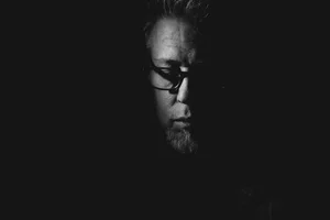
TARK-02, adjusted.
Welcome to part one of the EXP 77 Visual Dive. In this post, we’ll be examining the main control points—essentially the adjustments that were used to achieve the various looks, which can be modified to suit our needs.
Before we begin, however, I want to reiterate that none of the following adjustments are necessary. I created EXP 77 with the express purpose of throwing both caution and over-analysis to the wind. The great joy of shooting instant film lies in its element of surprise, in the lack of control, almost as if the camera and stock are other actors, improvising their own words. So I’d suggest using this pack in a similar spirit if you’re up to it: grab the camera, shoot JPEG images (as close to film, in terms of commitment, as we can get with digital) and apply whichever EXP style feels right. Believe me, it’s fun and actually…liberating?
I initially toyed with the idea of expanding this set even further by including sub-styles. VSCO used to do this back in the day (in LR), with ± versions of each individual preset, one-click adjustments to specific parameters such as clarity etc. But I quickly realized this would’ve resulted in an explosion of the number of variations in the pack, making it a lot messier. So instead, I went with the adage: a fishing rod is better than a barrel of fish. I’m paraphrasing, but you get the idea.
All the slider’s parties
The video loop above provides an overview of all affected parameters, for each style. If you look closely, you may notice a few things:
Some styles use the same curve, but the histogram display changes drastically. This is due to other parameters, mainly in the Exposure and HDR panels, affecting the final results.
The Color Balance wheels see the most action, by far. Notice how the luminance sliders (on the right of each wheel) are also being used to affect the corresponding tonal values. Raising the shadow luminance, for example, is a quick way to tweak the fading of black levels.
GOLDB-01 and 02 slightly shift the red values through the Advanced panel in the Color Editor. They’re the only styles to make use of this function. All other colour alterations are solely created through the Color Balance tool.
This approach to emulation was absolutely not scientific. Every style evolved organically, sometimes branching out from a previous one. I relied on my eyes and used anything that made sense at the time. TARK-05 and 07, for example, are based on the same colour shift and curve, but I decided to keep them distinct after testing on several images. If the style lead me on a different, worthy enough path, it earned its own slot.
The pack’s PDF guide mentions three areas that affect each style’s appearance: Clarity, Exposure (which includes brightness and shadows) and Vignetting. As you see from the video above, there’s a lot more going on behind the scenes, which means we can tweak much more aggressively. But sticking to these adjustments achieves two goals:
It retains the nature of the look.
It keeps the process simple.
I know I sound like a broken record, but speed really is part of this concept. In most cases, our decisions will only revolve around pushing or pulling, deciding on a global sharpness level, and styling the edges of our frame.
Clarity = softness
It may seem odd to list Clarity as the very first parameter: that’s because it’s playing a much larger role than usual. Clarity and Structure are typically minor adjustments we apply towards the end of an edit—like a dash of salt or a drop of Tabasco. I also often apply this locally, to tighten a specific area or pull the eye towards a focal point. In any case, less is usually more.
Not so with EXP styles: instant film has an inherent softness (a big part of its charm) that is replicated here through negative Clarity and Structure values. Every style defaults to a more or less intense version of this. Here’s a random sampling, zoomed in (image #1 is SOOC):


As you can see, the change is pretty drastic. But what I love about this tool in Capture One is how nuanced it is: Structure targets micro-details and edges, while Clarity adds broader definition, so there’s a lot of control behind these two sliders. I suggest raising both independently, keeping some form of softness. Typically, I find that a lower Clarity combined with a higher Structure creates an interesting mix, but it always depends on the subject.
Brightness = a lot
If you’re familiar with Rubicon, chances are you’ll be familiar with the way exposure and contrast affect some EXP styles. That’s because toning is applied to shadows here as well: when shadows are brightened, the tint/toning changes in intensity, which can alter the entire look of certain styles. The magenta cast in TARK-01, for instance:


But that’s just part of the story. In EXP 77, toning is also used on midtones and highlights, which are much harder to get rid of. Basically, the idea is for colour shifts to stick, no matter what, and this is achieved through compressed RGB curves. Go back to the video loop and notice how the bottom and top in all curves are respectively higher and lower than 0-100. Forcing tonal values into a limited range allows us to push and pull a lot more than we usually could—as I’ve described in other posts, the curve becomes a brick wall on both ends of the spectrum. This, in turn, supercharges the Brightness slider. In fact, I believe it’s often possible to tweak using ONLY this one slider:


The goal isn’t a correct exposure, but a creative one. Most points along that slider will be as valid as any other. On raw files, the Exposure slider can also be used for further control, but Brightness still works very well in most situations. An additional trip to the Shadow and/or Black sliders in the HDR panel will often be all that’s needed to refine the results.
Vignetting = Edges
This is a trick I’ve often used as part of my processing workflow: using the Vignetting tool not only with negative values, but positive values as well. Sometimes just a bit of positive vignette will open up an image, add some air.
Here, again, the tool is used a bit more aggressively, to mimic instant photographs. Most EXP styles are applying a negative vignette, while three of them go—slightly—positive: BLACK-01, GOLDB-03 and TARK-04.
I had to commit at some point, but in truth, I believe all the EXP styles lend themselves to creative vignetting—it’s in the nature of what they’re attempting to replicate.
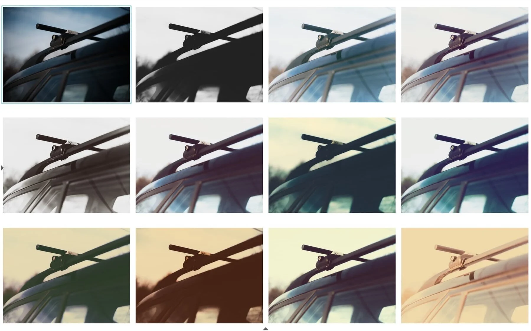
Look at the impact, on all the styles, of a quick boost of the vignette slider, with no other adjustments made: the first set shows all styles applied at their default settings, the second one applies a positive vignette. FYI: image #1 in both grids is the picture SOOC.

Summary
The takeaway is this: a few sliders can result in quick, massive transformations. There’s no real need to spend hours on processing.
Most of the parameter changes in EXP 77 break with the usual safety zones, which should wreak havoc on most image files…and let’s face it: it does. But hopefully this happens in a fun, experimental way— and I hope this post has provided a glimpse into the actual simplicity of using this pack. It’s all about accepting a level of randomness in the results. Like kids with an Instax or an old CoolCam.
That said: yes, it is nice to process further in certain situations. So in part two we’ll look at a few other tweaks, as well as using layers and local adjustments as part of a stylistic approach. Stay tuned.