External Analysis 001
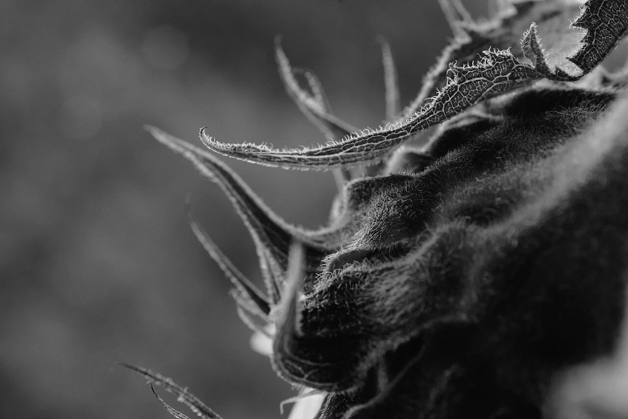
John St. John Smith
sunflower + tea kettle
Note: this being the very first instalment of EA, I want to extend a special thank you to John St. John for diving in while the water’s still a little cold :)
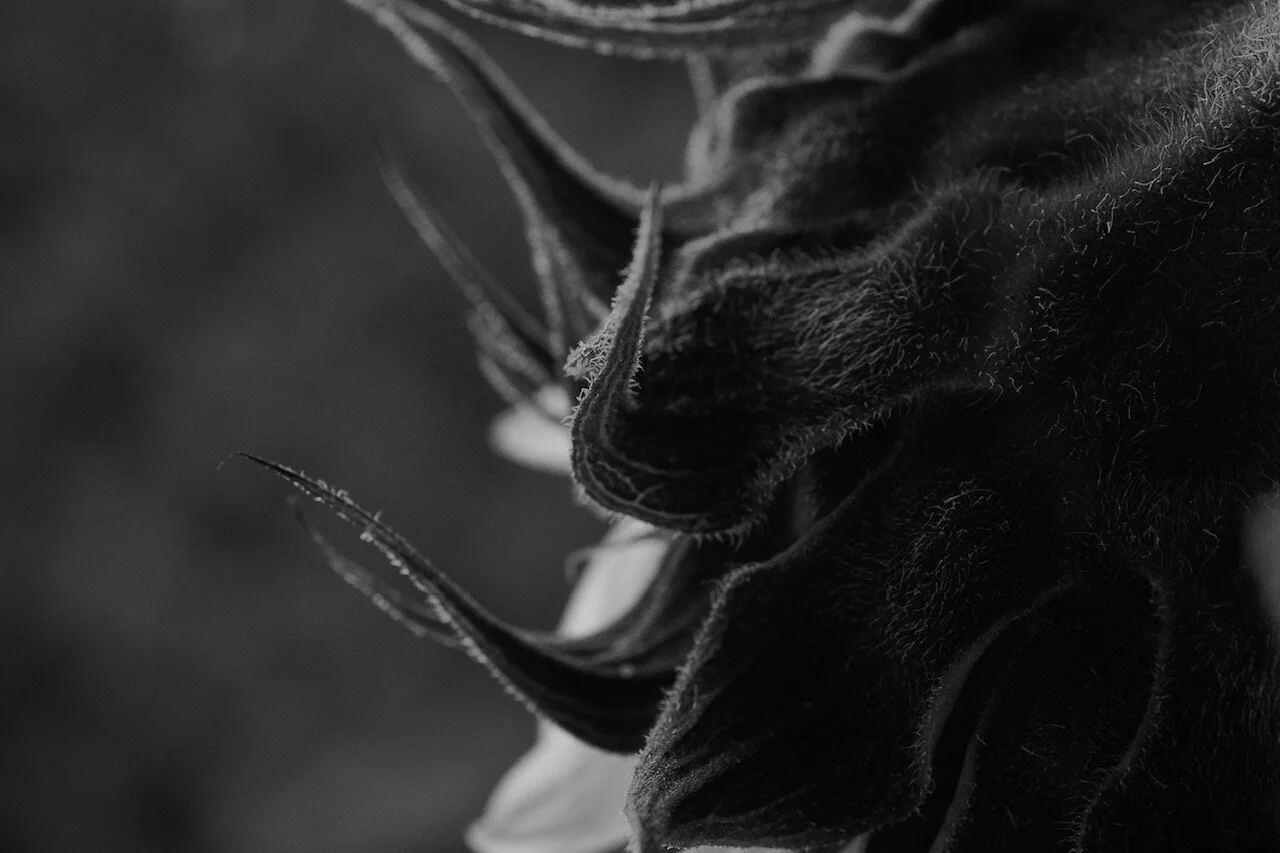

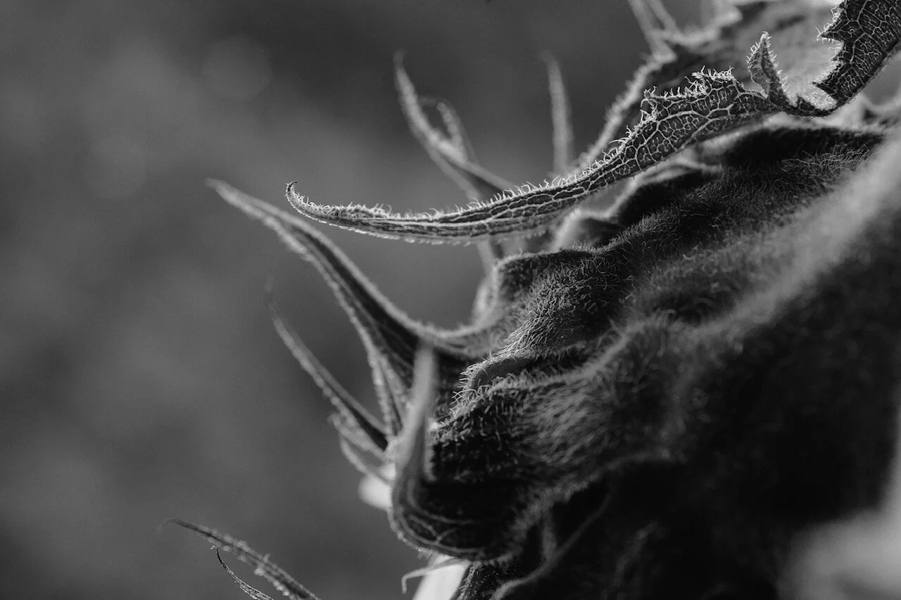


“The BTS to this, my brain thinks lockdown but in fact it was October last year. Since I bought my used X-Pro1 back in 2018 I’ve been playing with my Nikkor 60mm Micro predominantly with flowers. I shot in black and white to make the viewer think about what they’re looking at. I didn’t want any visual hint of it being a sunflower. It’s interesting but ugly, slightly uncomfortable maybe?
On the kettle (if these are the images used),I noticed the light reflecting inside when I went to fill it up for a cup of tea, and thought it could make an interesting abstract. This was captured during lock down.
Images shot in RAW and jpeg but jpegs used.”
These are two distinct series of images and I could’ve selected just one—in fact, I believe this was the assumption. But I thought it might provide an opportunity to reflect on visual associations. First however, let’s break this down.
The Sunflower
These are well done but I notice two issues:
#1 and #3 are very similar—nothing wrong with this but it leads me to pick one or the other.
#2 has blown highlights in the upper-left corner.
I don’t necessarily mind blown highlights and in fact it can be used to strengthen an image in certain situations. In this case however, it’s forcing my eye away from the subject. It’s also completely white, as emphasized by the background. So I’m going to use a linear gradient with the Curve tool to slightly compress that portion of the picture:

I’m also going to add a radial gradient to just slightly punch up the area that I believe deserves the most attention:

Not shown but structure was also set to 28 in order to tighten the edges.
Let’s also bring image #1 closer to #3 in terms of exposure, using the HDR tool:

With this adjustment, the choice between those images becomes solely about the flower, the textures and the focal point. Both work in my book, just not together.


The tea kettle
I see no problems with these pictures except:
Orientation: which one do we pick?
Colour: the copper tone is quite lovely but... I’m thinking of combining them with the sunflower.
Result: I’m making an editorial call and going for a landscape orientation AND monochrome. Here’s a straight BW conversion:


Now let’s combine them with the sunflower shots and see what we get.
Variant 1
Variant 2—yes, I’ve switched to portrait orientation…!
And of course, I prefer the portrait version. Which goes to show nothing should ever be set in stone. I think the reason is, it further breaks up the identity of the sunflower. More unexpected maybe?
The takeaway: we can impose our will to any set of images, as long as we provide a good enough narrative. In this case, even if both are very different subjects, the black and white treatment acts as a unifying agent and steers our attention mainly towards what becomes a study on shape, a narrative that’s purely visual. And I believe most viewers’ minds will accept the association, however mismatched, because it is clearly intentional.
We decide what works. No explanation needed.