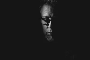
Visual Dive: RUBICON

IN-DEPTH GUIDE TO THE STYLE.
RUBICON is amongst the very few “extreme” styles I’ve created (I also have a few instant simulations that will probably be part of a future Pack). The advantage of this in terms of understanding processing as a whole, is that it touches on several core concepts—density, layers, toning, grain—that are sure to prove extremely useful in pretty much any circumstance.
But first, some background.
THE BTS
I think it’s worth understanding how this style came about.
2018 was a busy year: I was hired on the GFX 50R promo project and we shot a video for it; I spent a week at Photokina, presenting on the studio stage; and I also did a series of talks about the GFX 50R—in Montreal, Toronto and finally, Vancouver.
It was this last trip that eventually lead the creation of RUBICON. True to my motus operandi I used a single camera/lens combo while I was there: the X-T3 (which I’d just acquired) and the XF 35mm f/2 R WR. This was my first camera with the Eterna film simulation and I decided to use this exclusively.
When I returned, I had a story to write for our KAGE Collective project. I was concerned about the US mid-term elections so the tone became rather political and I decided to use images of Vancouver to illustrate it. They obviously weren’t related to the subject, so the idea simply became to convey the appropriate mood for the piece. The flat Eterna files could essentially be pushed in any direction, so I went to town, using the text of the story as my lead.
In my mind, the words I’d written were dark and a deep shade of red. I named the story Rubicon.
RUBICON—the style—was meant to be disposable. Just a one-off visual experiment. But the more I used it, the more I realized it could be much more versatile than I’d first expected. I’ve since used it quite a bit.
VISUALIZED
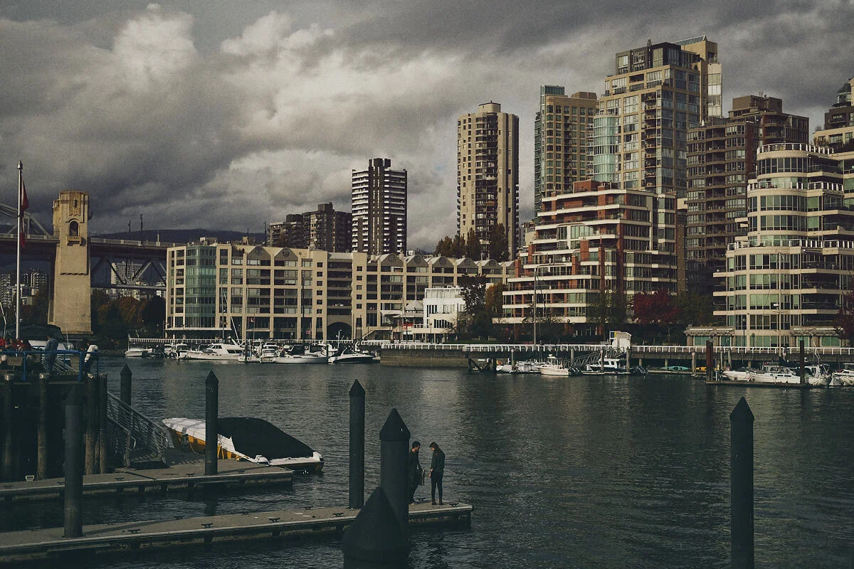
Here’s an original Eterna JPEG from Vancouver:

X-T3 | ISO 160 1/8000S f/2 35 mm
It is flat. It is also slightly underexposed but that’s fine—as a general rule Fujifilm files (both raw and JPEG) tend to be much better at dealing with shadows than highlights. Besides, what’s important here (always, really) is to have the information we need. In this case, it’s actually more than we need.
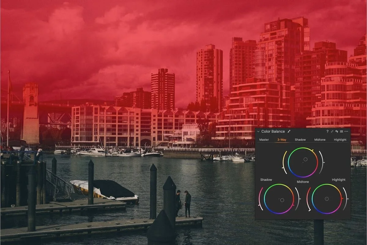
Now for the fun part: let’s apply RUBICON.
?
I’m guessing this is the point where most of you are probably thinking “well…THAT doesn’t work!”. It looks awful doesn’t it? The thing to remember however, is that all the information we saw in the original file is still there, it just needs to be brought back, as in: we must fit the style to this particular image. Let’s raise the brightness slider.

Better
We’re basically back to more or less the same overall luminosity we originally had—with new toning and compression in both the shadows and highlights. Let’s move to the Curve tool, grab the middle point (mid-tones) and move it up and to the left, matching the mid-tones in the histogram:


More better
Now we’re getting somewhere. But it’s still too dark and how we deal with this depends entirely on the final look we’re after. We could use the Exposure or Brightness slider:

Here comes the sun
It’s fine but the mood is gone. That’s because those two sliders are too broad in scope and they affect too much of the image. Quick note: see how the reds are much less prominent? That’s because the magenta tone is applied to the shadows. More on this below. Anyway, let’s pull back and use the Black slider in the HDR tool instead:

The shadow information is back but we haven’t affected the mood at all. I’m finding those shadows a little too compressed however, so let’s go back to the Curve tool and drop the lowest point a bit:

Better. Subjective, obviously, but I prefer this. Here’s a before/after crop that makes the change easier to see (look at the shadows on the left specifically):


LAYERING
Right. Now let’s do all of this again but this time, on a layer instead of the background.
You might notice the grain is gone. Styles applied to a layer can only include adjustments that can be applied locally—which is most tools but not Grain or Vignetting, for obvious reasons.
What if we like the look but want to tame it down a little? With the style applied to its own layer we can easily control every adjustment in one go with the Opacity slider, mixing in as much or as little of the look as we want. This is our adjusted RUBICON at 70% opacity:

TONING
RUBICON is basically a split-toned style and you can control this very easily in the Color Balance tool. There’s a magenta cast added to the Shadow wheel and an orange cast added to the Midtone wheel:

Both can be modified, changed to another colour or taken out entirely. Here’s a different take adjusted only through those two Color Wheels:

Presto!
Tons of possibilities. We can even mix things up by adding a linear gradient with its own Color Balance mix:
One last detail: the red object on the bottom right was annoying as hell. I used Capture One’s Repair Tool to quickly remove it
…
So, the key takeaways for Rubicon:
The look changes dramatically by altering luminosity/brightness.
The Curve tool adjustment needs to be tweaked for each image.
Grain and Vignetting are only applied on the Background layer.
Toning is controlled through the Color Balance tool.
Hopefully this has given you a taste for what can be achieved with this style. If you have any questions, hit me up in the comments. I leave you with a few more RUBICON images to finish things up.