Parallels - Michael rawcliffe
I was very much looking forward to this one: Mike graciously sent in raw files from his new Leica Monochrom M11.
But first, an aside. You see, I've always been skeptical about the real-world benefits of a monochrome sensor. I understand the science behind it, and I also get the romantic aspect of a black and white camera (it matters, everything matters). But a monochrome sensor imposes an important concession when it comes to digital post-production: no colour channels means no BW mix. We can't alter the “film sensitivity” after the fact, as we can with a colour file (even a JPEG). The argument is that it doesn't matter. That the technical benefits overwhelmingly outweigh any potential compromises.
Years ago, I visited a book editor in Maine and we hit it off. He'd just bought the very first Monochrom camera and showed me a couple of images he'd shot. Nice pics, nothing wrong with them at all, but beyond the full frame/lens combo, I couldn't see anything that would be a challenge to reproduce with my Fujis. He sent me a raw file when I got home—still nothing.
Now Mike: please don't take this as any sort of dis against the Leica, or the pics you sent in. I love these street scenes, and the M11 is obviously a fine piece of gear. There's also a very important, non-negligible shift that comes from shooting purely in black and white: it's a framework, it imposes its own way of seeing. I sometimes choose to shoot Acros JPEGs for those same reasons. But on a purely technical level... I still have trouble understanding the visible advantages of a monochrome-only camera. I get it on paper. I just don't see it.
That said, I'm super grateful to have gotten the chance to work with these images.
/End aside.
…
Colour can be a deep pool of never-ending choices that ultimately leave us breathless and convinced of our absolute mediocrity. Really. This look, that look, warmer, colder, tint, no tint…colour can be head spinning. Black and white by comparison is a nice, quiet, country road. The work isn't necessarily easier, just less ambiguous.
In case you missed the previous instalment of PARALLELS: the idea is that I receive raw files and edited JPEGs in separate folders. I edit the raw files “blind”, and only look at the edited versions after I'm done.
I'm going straight for the comparison this time, and I think you'll agree it drives the above point home pretty clearly. These are the raw files:


And these are the edited files—Mike’s on the left, mine on the right:


Close you say? Erm, yes.
Spot the differences
IMAGE 1: Frame 623 - The Explorers
Black and white is about contrast, and we both obviously moved in a similar direction, on both images. In this one, the main difference lies is in the way we balanced the scene: Mike's version is “hotter” in the centre, and the sides remain part of a vignette. I took a slightly different route:
I cropped out the family on the right. Honestly, I'm still unsure about this: the shot is tighter, but you lose some "air". It also introduces a necessary compromise between the street are and the sky. Looking back, I prefer Mike's framing. But…
My reason for cropping: to emphasize the group of people on the left. There's something very rich to my eye about the mother and kid standing in the street, the folks on the sidewalk just behind them, and the man in front of the bike. In fact, the entire scene for me is about the people in the background, and I tried to process the image accordingly. I love the woman leaning down to speak to the other woman in a wheelchair too, all these small interactions happening at once.
The rationale is that the sled is a kind of anchor I want viewers to bounce off of. I finally ended up with eleven masks, all mostly variations on exposure:
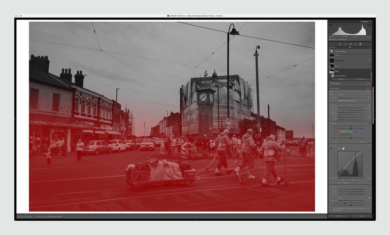
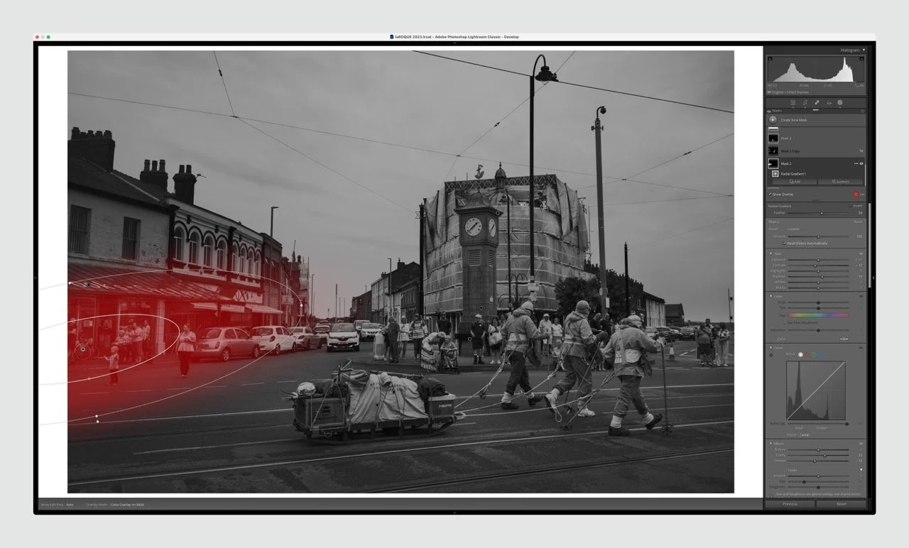
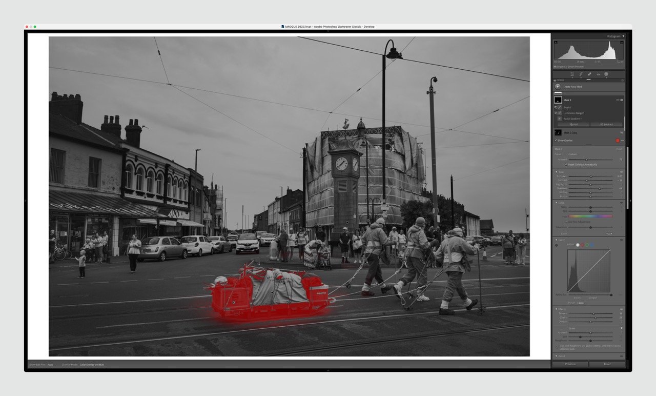
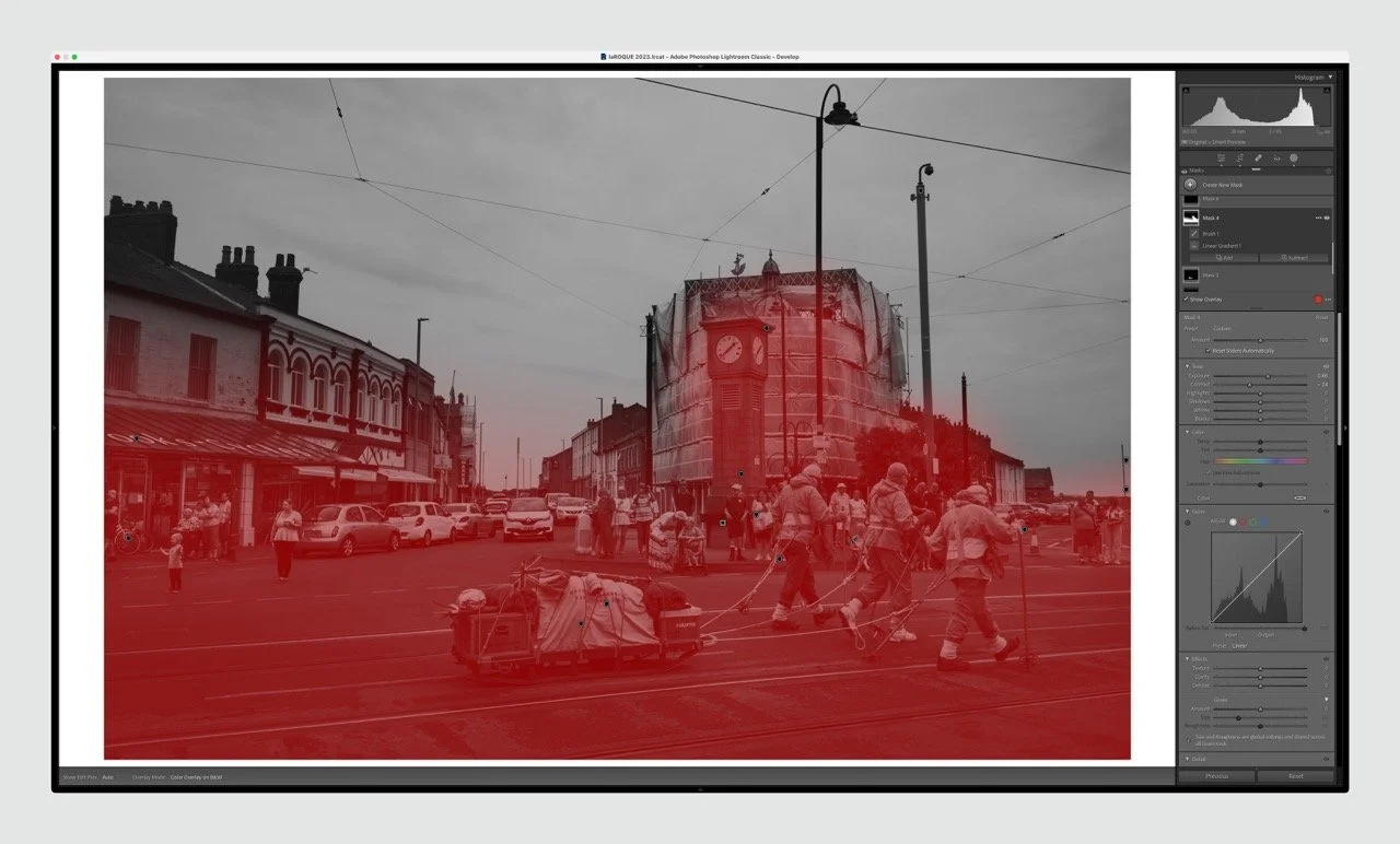
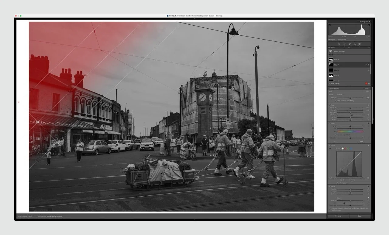
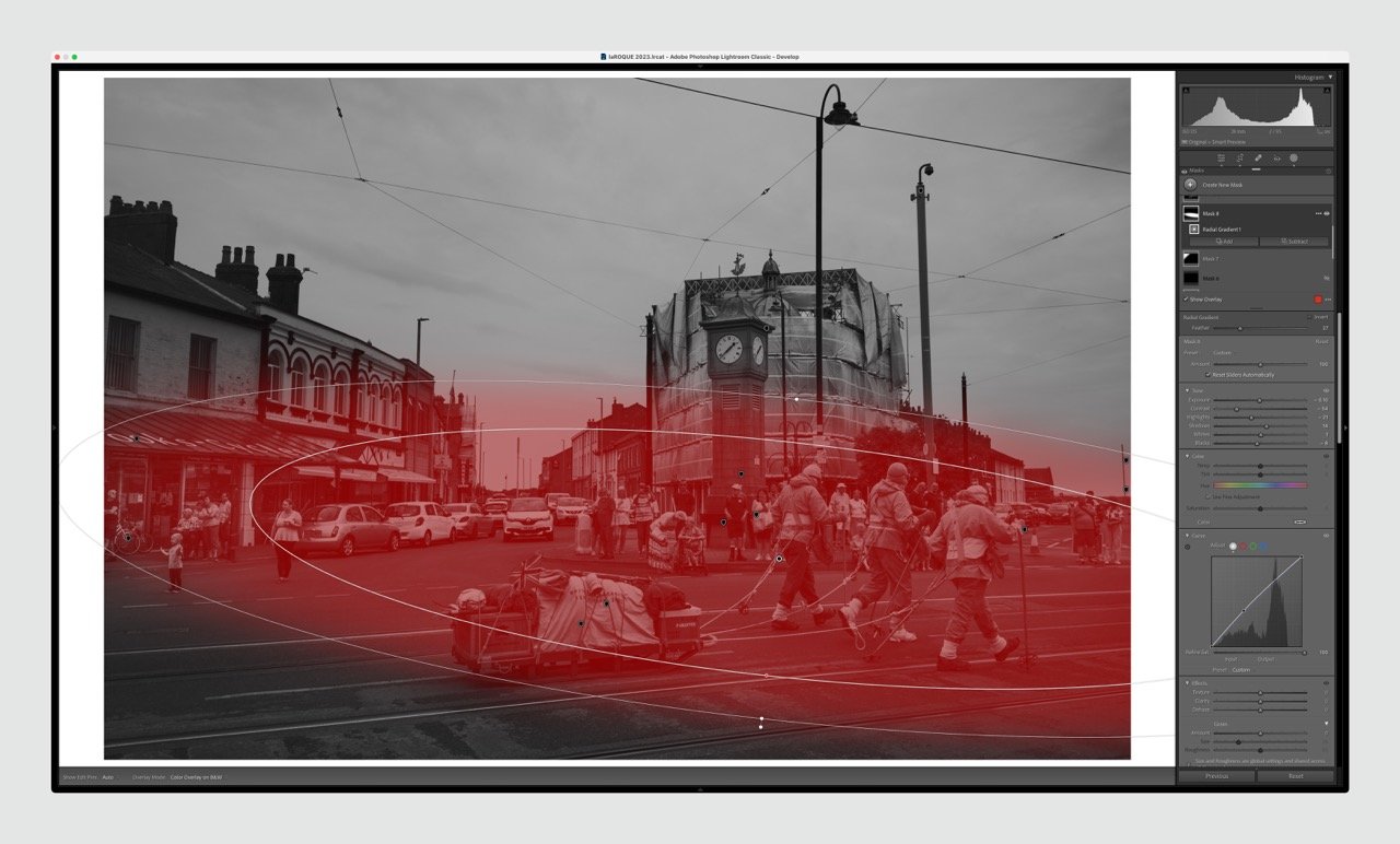
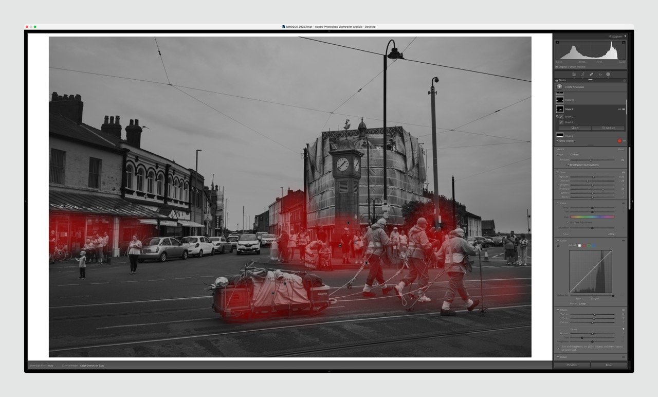
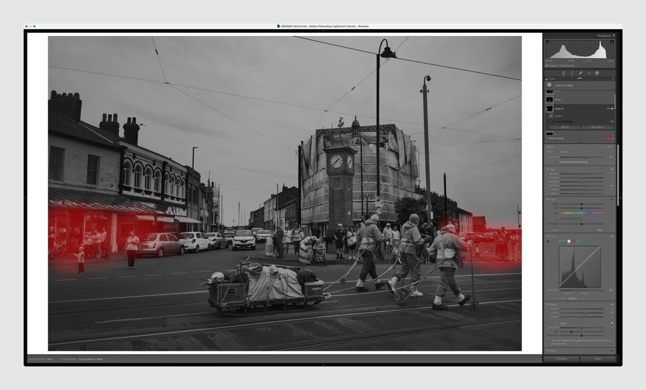
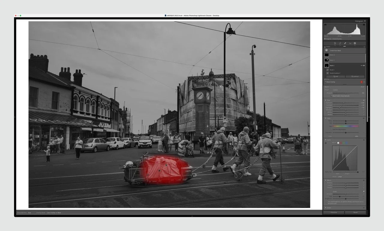
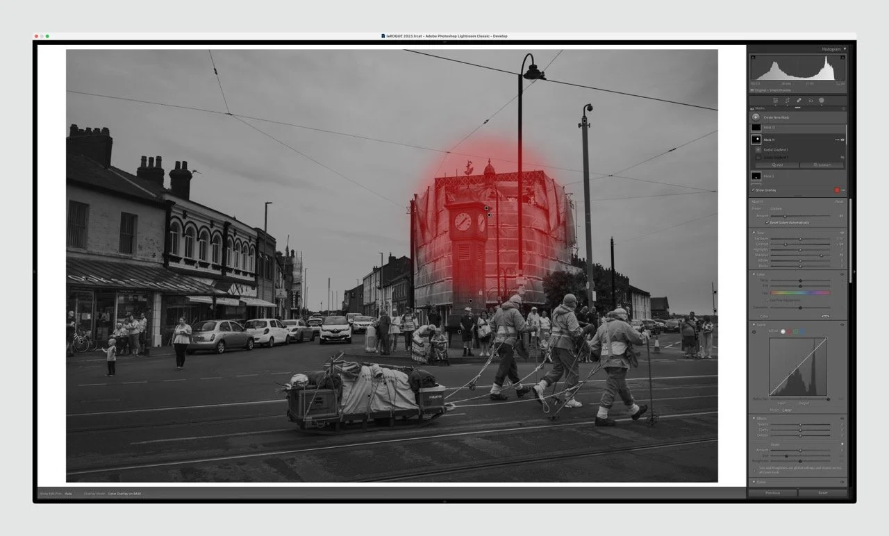
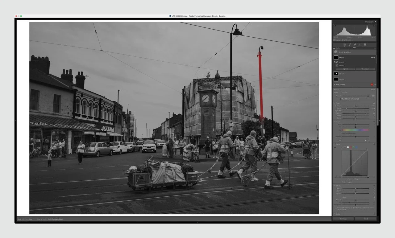
IMAGE 2: Frame 342 - the Morris Dancers
Truth be told, I didn't spend as much time on this second image (I prefer the first one). I altered the angle slightly (I'm not sure why), and took a similar approach to image 1, bringing back as many people as possible from the background (the old man in shorts is priceless!). I find it a bit too aggressive, in hindsight, but that's what hindsight is for. Eight masks this time, again all about changing balance:
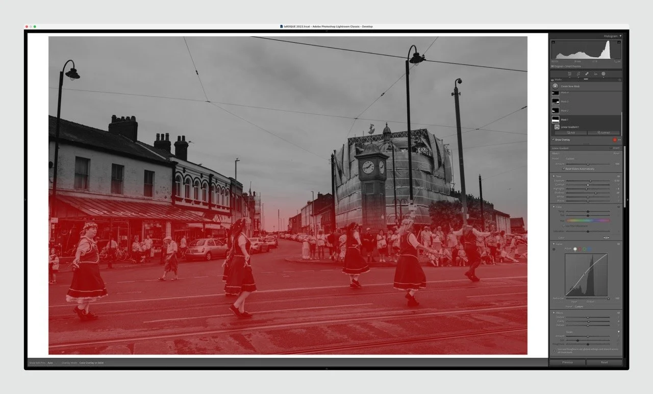
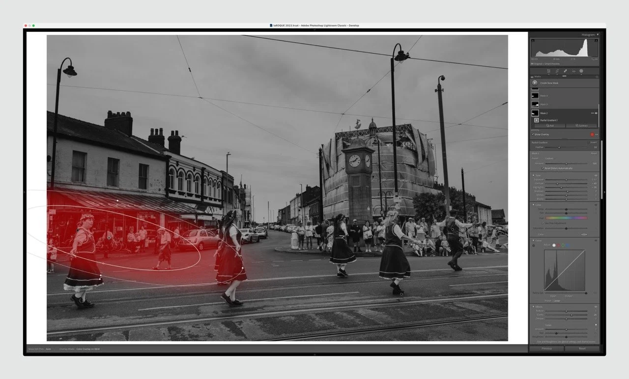
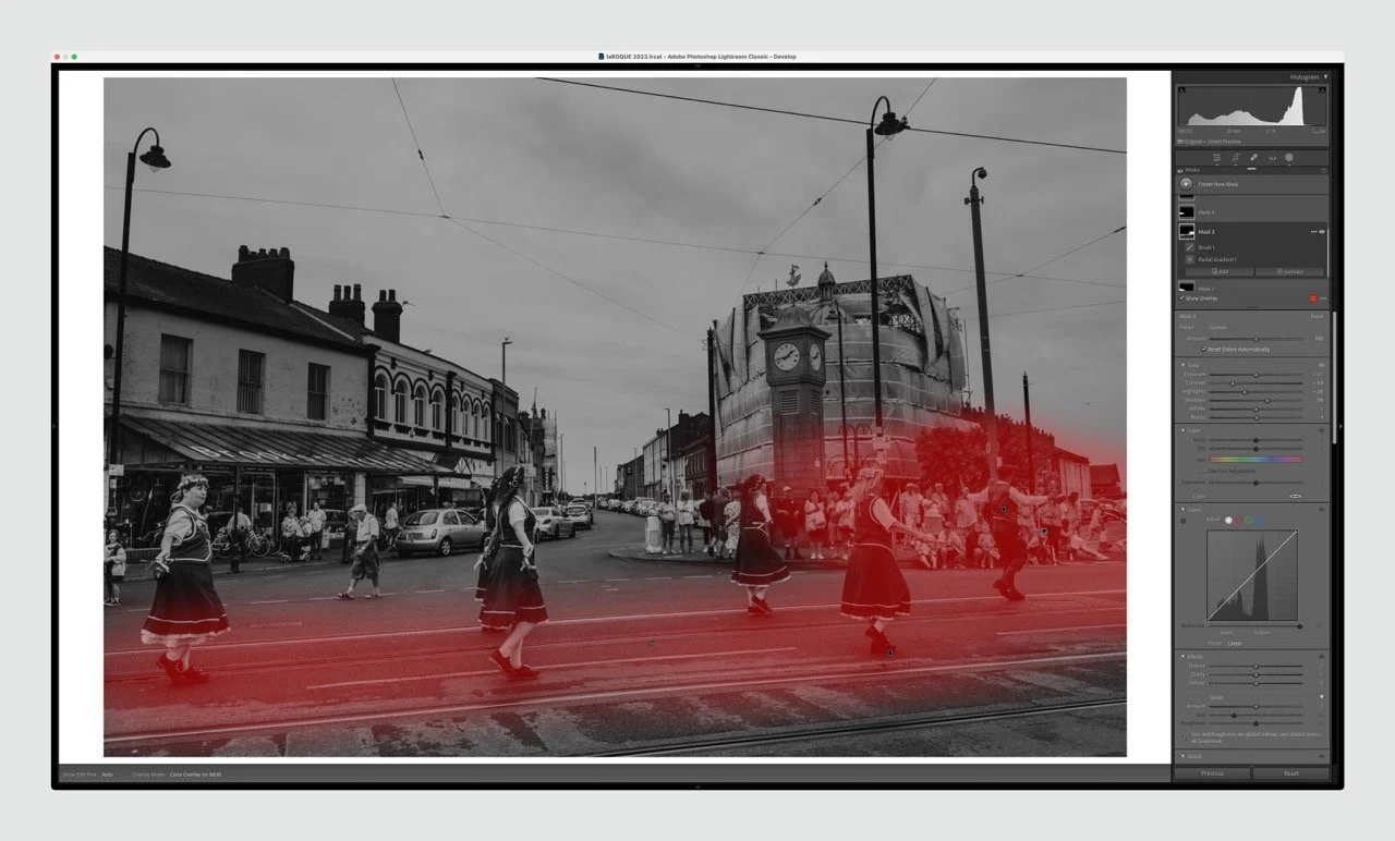
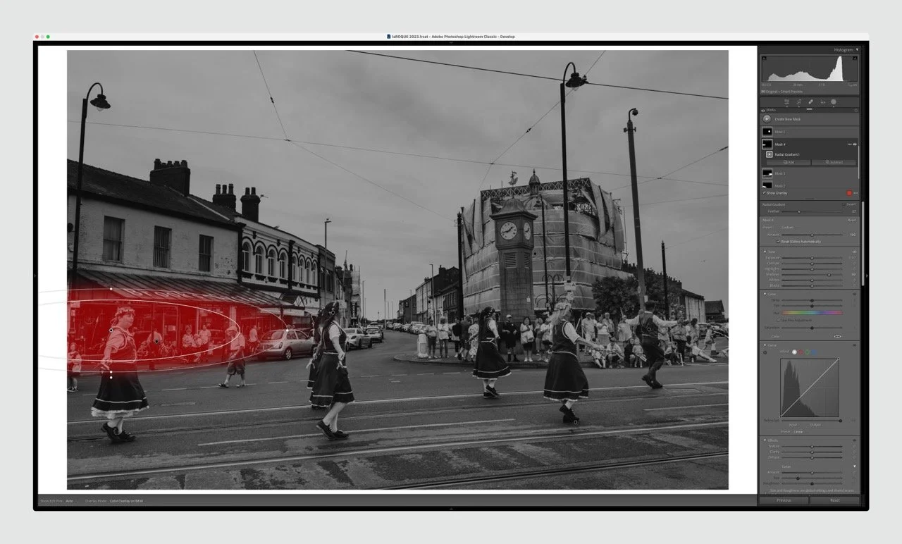
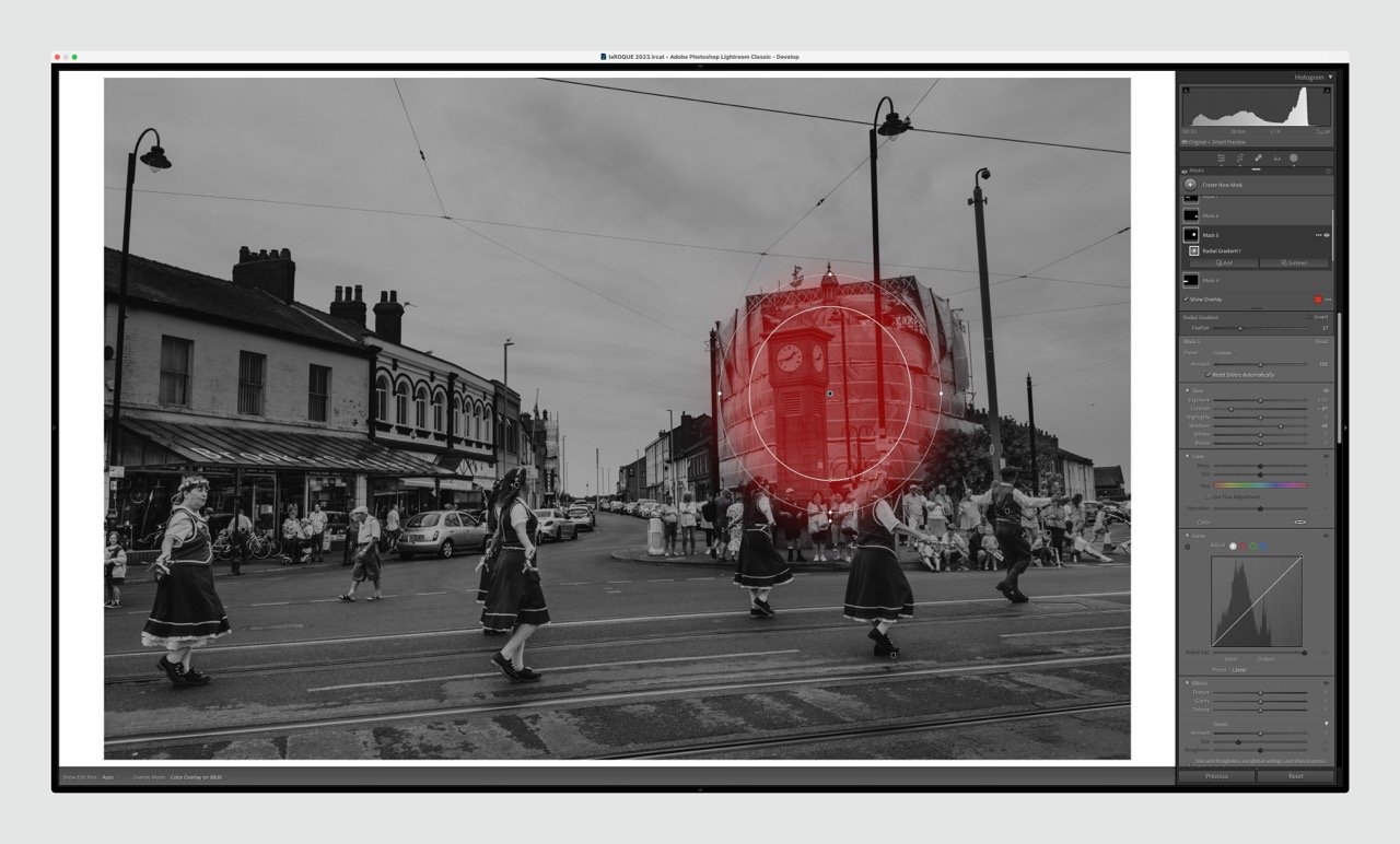
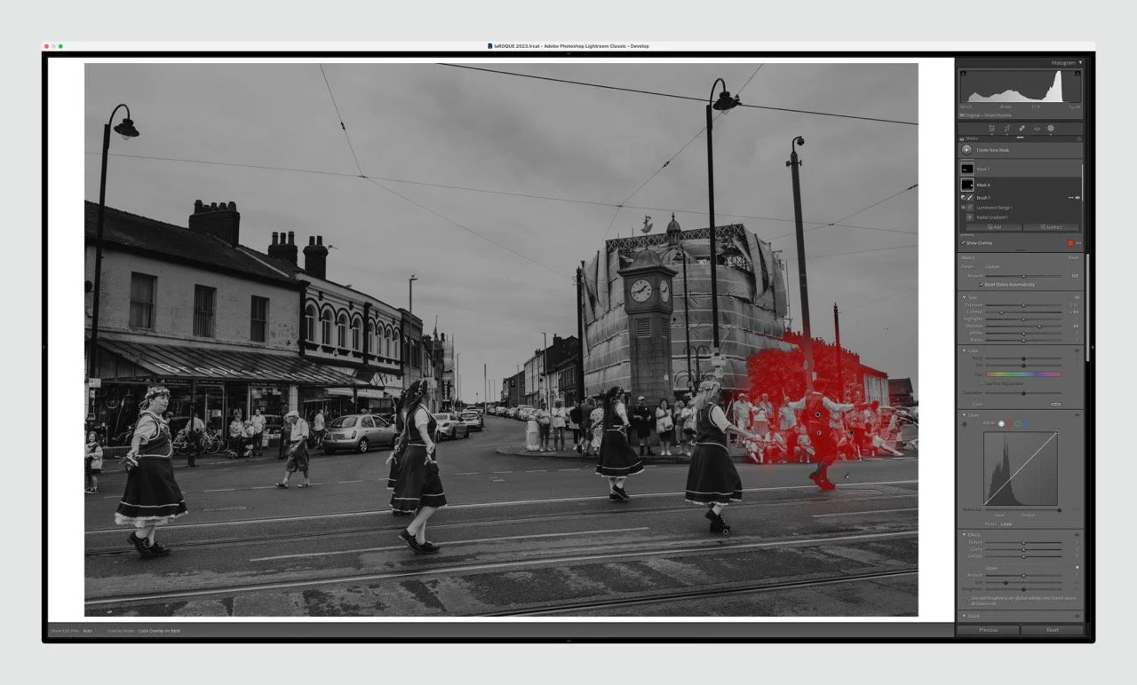
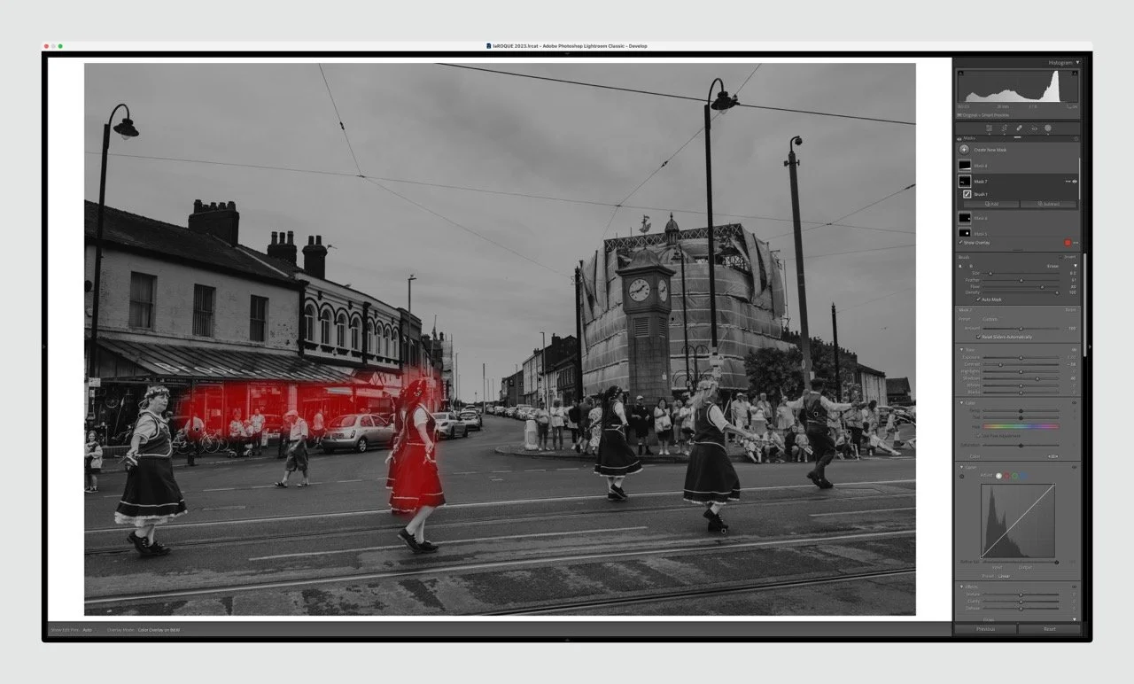
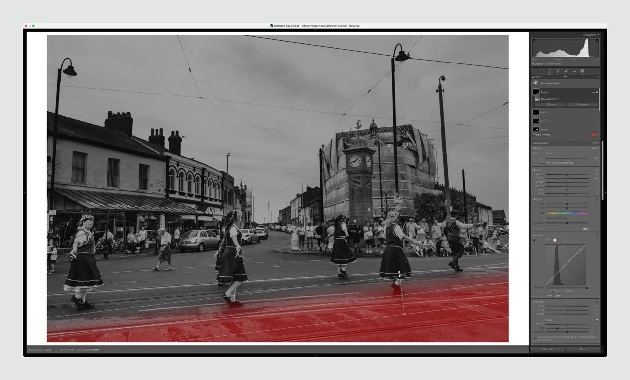
So that's my take. But Mike also sent along a thorough analysis and walkthrough, which he's very graciously agreed to share with everyone—huge thx for this. If you want to play along as well, please don’t hesitate to get in touch.
Without further ado: Mike, the floor is yours :)
P.S I only read the notes after writing this post. Interesting parallels here too.
Notes from Michael Rawcliffe
Both of the photographs were taken during the Fleetwood Carnival parade just over a week ago with a Leica M11 Monochrom and 28mm Summaron lens.
I used ‘Silverchrome profile P3200’, from a set of profiles and presets I had downloaded from Jeff Anscough.
Jeff, and his wife, Sarah, have a YouTube channel ‘Walk Like Alice’ (part of a quote from Photographer Tony Ray Jones) as well as a website (each) that sells prints and promotes their work. They are of interest to me because they both use the original Leica Monochrom camera and photograph in my local area. I thought that the profiles and presets would give me an idea of what the Monochrom was capable of and this has proved to be the case, although I am already deviating from them; and will no-doubt create my own workflow. I do find Jeff’s Lightroom tutorials very informative (although he tends to burn-in the sky a little too much for my taste, but of course YouTube only gives a compressed view of the actual workflow).
Frame 623 - The Explorers - has had the following adjustments in Lightroom Classic…
I chose profile P3200 and adjusted the Amount slider to 112. Add a sky mask. (Mask 1). No adjustments. Add another sky mask (Mask 2) and invert it: this allows me to adjust the scene without affecting the sky. Amendments to the mask are:
Exposure +0.82
Shadows -16
Mask 3 consists of a brush to the base of the photograph,
Size of brush, 4.1
Feather 100
Flow 21
Density 100.
I used this brush to darken the base (bottom) of the photograph slightly to direct the viewer to the explorers.
Exposure -0.35
Shadows -11.
Then I went back to Mask 1, the Sky Mask. I used the adjustment button to the left of the curves tool, selected the brightest part of the sky, and pulled the curve down slightly - just to take the highlight off the brightest area - but not affecting any other area of the sky.
Mask 4 and Mask 5 are Object Masks of the little boy on the left of the photograph and (presumably), his mum. They are very important in balancing the scene: without them the explorers would be too far to the right of the frame.
For the little boy:
Exposure +0.10
Highlights +15.
For his mum: Exposure +0.10
Shadows +7.
I think it was at this point that I made adjustments in the Basic panel:
Exposure +0.05
Shadows +16.
Masks 6 and 7 are both Linear Gradients, applied to the left and right side of the frame respectively.
Shadows +15 for both: just to bring more attention to the little boy and his mum on the left side and to balance the right side of the frame with the left after the adjustment.
Mask 8 was added at the last moment. I noticed that the front lights of the two white cars behind the sled (being pulled by the explorers) gave a highlight warning, so I used the Curve tool to just tweak the top right corner down and adjusting the curve back to its default position (apart from the topmost corner) as much as was possible. I used the curves in a mask rather than the the curves adjustment in the Basic adjustments panel to make sure that I didn’t undo all the work I had already done at the last minute. It was a good decision as it took me a few attempts before I was happy with the result.
Grain is from Jeff Anscough’s presets: Medium. I adjusted the grain to:
Amount 27
Size 5
Roughness 79.
Sharpening is set to Light. I used the Option key when looking at the Radius and Detail sliders within sharpening. I left Radius at the default but adjusted the detail slider:
Amount 25
Radius 1.0
Detail 30
Masking 0.
I didn’t used the Curve tools in the masks (apart from a light touch with Mask 8) as I didn’t want to introduce too much contrast.
When all adjustments were complete I used the amount sliders on the Colour Grading Tools to control contrast. I didn’t introduce any colour: I just moved:
Highlight to the right
Midtones to the right
Shadows to the left.
I then used the Balance slider to achieve the contrast I wanted.
Blending 50 (default)
Balance +20.
All that was left was to use the healing brush to remove the one dust spot.
…
Frame 342 - the Morris Dancers - had very similar processing.
Masks 1, 2 and 3. were adjusted with similar values to The Explorers.
Mask 4 is a Brush, used to highlight the faces of the three dancers closest to the camera and also the white sleeves of the leading dancer to the right (the man).
Values for the brush were:
Size 4.1
Feather 70
Flow 34
Density 100.
Adjustments were:
Exposure +0.36
Highlights +14.
Mask 5 is a brush used to lighten the white hem of the skirt of the lady on the left of the frame. Values of the (brush) were the same as Mask 4.
Adjustments were:
Exposure +0.43
Highlights +15.
Grain and sharpening are very similar to The Explorers photograph.