Parallels-Matthew Campagna
For this final Parallels exercise (under the 1EYE umbrella anyway), I'm doing something a little different: I'm writing the post before looking at Matt's processed versions. So as I type these words I'm still fully in the dark: did we choose similar directions? Are we at opposite sides of the spectrum? No idea. So you'll more or less be getting my live(ish) impressions to the "reveal". Fun huh? Well, I think so :)
Matt's images, I freely admit, really drew me in. Asia, as a whole, rates very highly on my wanderlust scale, but these pictures were also right up my alley: the scenery, weather, the moments and variety, all of it.
That said, out of eleven images I received (X-T5 raw files) I did leave out one:

People, people, everywhere…
I don't at all mind chaos, but I just couldn't find a way to "clarify" the subject. To my eye there are too many overlaps, too much visual clutter to contend with. I can imagine a path towards processing for the centre (where the action is), but this area is noisy as well, with bodies competing for attention and interfering with the general structure of the composition:
Why am I starting with a negative? 'Cause it's the only one I've got folks. Every other picture in this series is pretty spot on.
CHOICES
I generally try to stay in the "reaction" zone with submitted images, processing from impulse to better reflect how the work makes me feel at first glance, without second guessing. With ten images to work with, I quickly decided to split the series in half: five in colour, five in black and white. Some of these could've gone either way, but I'm a sucker for symmetry and I wanted two sequences that would stand on their own, with equal weight.
SEQUENCE 01


SEQUENCE 02


You're probably noticing a green tone in the colour images: that's a personal choice, and I'm genuinely curious to see where Matt went with his versions. Green hues are obviously a favourite of mine, but I was really guided by the mood of the rainy scenes, and used the toning to tie the colour series together. I think the treatment works pretty well at bringing the two outliers—the sunny motorcycle and restaurant interior—into the fold.
For the black and white versions, I chose a fairly gritty approach. In this case the guiding images were 2 and 3, which I immediately processed in monochrome for two reasons: 1) not that much colour to work with, and 2) subjects better suited to contrast than tone. This is especially true of image 3, with the bold geometry of the overpass cutting through what would otherwise be a somewhat cluttered scene. The main diagonal leads us straight down to the woman walking on the sidewalk, who becomes a small anchor.
Masking
Nothing extensive on this front, mainly just tuning certain areas if they needed it. As an example, here's the restaurant with only the main toning and curve applied:

And here's the final version with masking:

As you can see it's all broad gradients, each one tweaking a mix of exposure, contrast and shadows to balance the scene. On the image below, all I did was punch the orange umbrella at the centre of the image, using a radial gradient and the new Point Color tool:


The idea was just to slightly bring it forward as a focal point, without going overboard (looking at it here, the change is barely visible). Finally, here's an animation of the layer masks created on BW image 1. Again, all about balancing exposure:
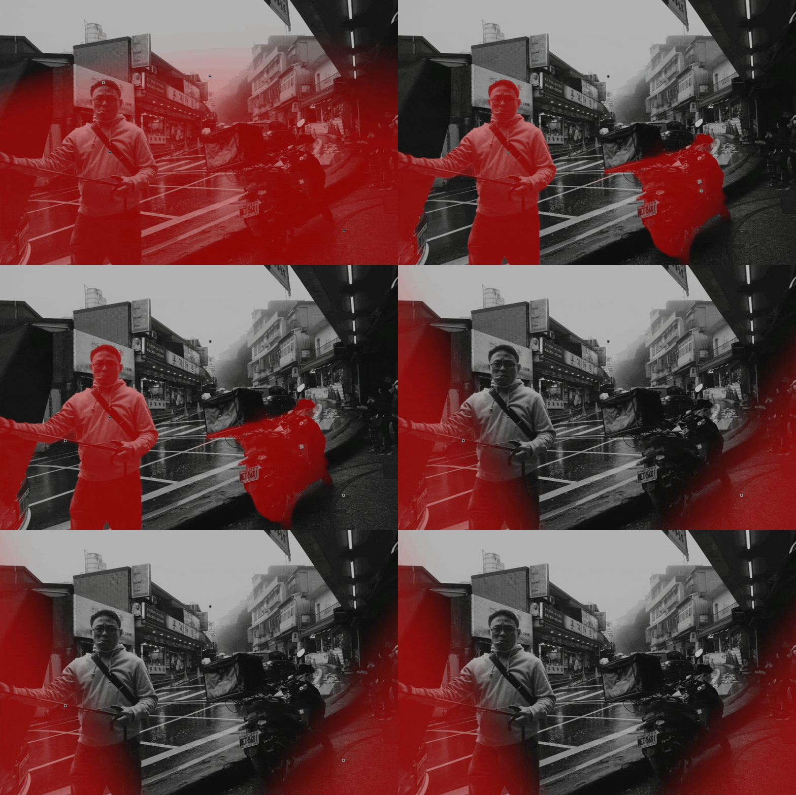
One last thing: BW image 2 is the only one I cropped (slightly), to tighten the natural frame in the composition. But frankly, it works either way:


DRUM ROLL…


Different ratios?? Ok, I wasn't expecting that at all! Interesting (you need to click on the images to see it btw). Now that I've "lived" with these images as 3:2, I'm experiencing a slight dissonance to be honest. Give me a moment.
First impressions (hopefully constructive): Matt's choice of processing isn't as "homogenized" as mine. Which is ok. I'm always working towards series and this taints my approach, no doubt about it. The restaurant image is a great example of a completely different take that's much more cinematic: the 16:9 ratio, but also the deep shadows that give the viewer no choice but to focus on the woman sitting in the beam of light. That said, I do feel this version would gain by lifting the older woman out of the shadows, just enough for her to register. I don't believe we'd lose any of the mystery. Also: the blue of the overpass makes the case for a colour version doesn't it? I didn't notice that. And as you can see, my black and white choices were entirely subjective. In fact, I hesitated quite a bit about the last two images (the reds reflected on the wet pavement really are lovely in image 10).
It's always fascinating isn't it? One image, two eyes. Well, four...You know what I mean.
A huge thanks to Matt for this great send off. This really was loads of fun :)