An Archival Dig

Hindsight, re-processing and luma masks.
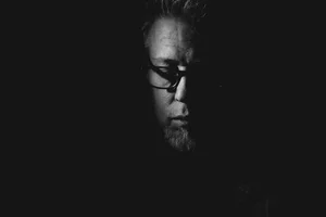
This post was meant to be a Dissection, a quick look into the past, at the image you see above—one I’m still very fond of, years later.
The picture is from the same trip to Cuba that I wrote about in this article, shot from a bus, just like those images. Except this was the ride going in, not the one leaving. Different light, different choice of camera setup and a vastly different mood. When I look at both series side by side, it’s hard not to see the excitement of a first day vs the weariness of the last. Our state of mind always shines through the images we choose to capture.
Out of curiosity, I went back to the original folder of images, to look at the “contact sheet” and check if I’d shot alternate versions, a few milliseconds earlier or later. But passengers have no such control, no way to pause a step and reframe: we’re along for the ride, grabbing whatever appears within the window. We accept that flow as fate. So of course, every still in that folder was unique.
I don’t delete images. Which means I carry a lot of extra baggage on my drives, but it’s not something I care much about: I’ve found enough “left-behind” pictures over the years to know the storage space is worth it. Photographers, after all, didn’t throw away negatives—I don’t see why our digital equivalents should be any different.
The image was part of a story I published at the time, entitled Bus to Caibarién. It’s strange to look at the essay now, with its use of colour and BW interspersed, something I rarely—if ever—do anymore. But it was even stranger to realize what I’d left behind in that original folder: my older eyes seized upon a very different selection of frames—many of which had never even made the cut, initially.
Hence, the sidetracking.
Take two: enter the Rubicon
I got curious is what I’m saying. I was using Lightroom back then, which means I no longer had access to the library. So I created a fresh Cuba 2021 catalog to experiment with, starting from the untouched masters (1).
I looked at the EXIF data: I was shooting the X100S on that trip, set to JPEG and the Pro Neg Standard film simulation—my goto at the time (2). The camera was set to manual exposure mode: ISO 1600, 1/2000s, f/10, the idea being to get as much DOF as possible, with a shutter speed fast enough to freeze the moving scenery.
Honestly, I expected to process everything in BW...until Rubicon winked at me, smiled its toothy smile, and I ended up with what I feel is a 1966-slide version of it. The image below is my new favourite:
I talk about this in the Visual Dive article but it bears repeating: Rubicon is a metamorph. Its appearance and overall effect vary wildly depending on brightness and exposure settings. The strong toning, which at first may appear completely over the top, can turn into a much more subtle warmth that can help blend an image together.
So step 1 was to figure out an overall look for these images, mainly by playing with brightness, shadows and tweaking the RGB curve. Once this was done, I copied the settings and pasted them on each subsequent picture. I do this a lot btw: once I’ve found the processing I’m after I copy all global adjustments and keep these in the clipboard, applying as I move through the files (3). I worked this way in Lightroom as well.
But although I was satisfied with the overall tone, I quickly pinpointed issues with shadows that would require local adjustments. I don’t mind blocked shadows at all if it’s appropriate to the image. In this case, I felt I was generally losing too much detail, for one, and the results also lacked air or lightness. The shadows were dragging down every street scene instead of adding dimension, as well as killing all nuances in the greenery.
Targets
I’m lazy. So I always begin with the easiest, least time-consuming option available—which is usually the radial gradient. Obviously, it’s great for faces, but it’s also useful for anything that requires direction or a more organic feel. I tend to use the brush as a second step if the resulting mask needs to be modified.
But I also love the Luma Range feature because it’s like having an in-house retoucher: when the conditions are right, a complex mask can be created with just a few tweaks to a couple of sliders.
A luma mask—as the name suggests—uses the luminance (or brightness) values in an image as input. Essentially, we tell it how much shadows or highlights should be affected by the mask, and it calculates the area on its own. I think it’s easier to understand with a picture:

So in this case, here’s how I proceeded:
I drew a rough radial gradient over the darker areas in the middle of the picture (4).
I played with a few settings and settled on raising the Black and Brightness sliders. But...
While the Black slider affected only the darkest shadows, the Brightness slider was affecting much higher values, making the sky brighter as well. So…
I clicked on Luma Range, checked Display Mask (to see what I was doing) and dropped the highlight point until the sky was no longer part of the mask.
I filled in a few additional areas with the brush.

The resulting mask. There’s a bit of contamination but not enough to affect the image. FYI: I used another layer for the palm tree on the right.
There. Complex retouching without much of the hassle. An important point to remember when using Luma Range: radius refers to feathering, which essentially amounts to how much the mask will gradually blend with its surroundings. This is typically better at higher values to avoid weird, jagged edges.
This process was repeated on every image, but since all of them shared the same light and contrast, instead of going through the whole thing every time, I threw my own rule out the window and pasted the mask layer along with global settings. So we’re talking a full copy/paste, including all layers. I then simply needed to adjust the mask’s placement, by either using the radial gradient or a brush/eraser combo.
It sounds long and complex but it was in fact very quick. Here’s a new selection of previously unpublished images (apart from The One):


...
Stepping back from the technical aspect, there’s a larger issue at play I think: the way we change. I’ve always thought of photography as an act of recognition, but this ability, like everything else, is transformed over time—by our experiences as much as by the physical changes we go through. I don’t see as well as I used to...is this why I’m more and more drawn to abstraction? How much of who we are does our photography reflect?
I still like that older bw version—there’s an intemporal quality to it. But overall I don’t perceive images the way I did seven years ago. I don’t analyze them along the same lines. Which doesn’t mean we should eternally be retracing our steps, but it does make the case for perhaps being less impulsive with dismissal or deletion.
Hindsight may eventually shine a new and unexpected light.
…………………………..
I may end up merging the catalog with this year’s main one (with a dedicated Cuba 2021 collection) to keep things tidy.
No, I didn’t see this through the EXIF: I just know that was the setup. Before Classic Chrome I shot everything in Pro Neg Standard. I recognized it instantly.
As opposed to applying a global style to several images at once. It avoids having to redo the same alterations over and over on each picture.
I could also have created a filled layer and erased unnecessary portions afterwards. Many ways to achieve the same results.